
This is a single article from a series about creating of an advanced Data table component using React, TanStack Table 8, Tailwind CSS and Headless UI. In this chapter we focus on table editing capabilities
The data table saga continues. In the previous chapters, we focused on table viewing features, and now it's time to implement table editing.
The editing process we'll implement follows a common pattern: the user first selects one or multiple rows and then applies an action, such as editing or deleting, to the selected data. So basically, the selection here works similar to focusing in photography.
Enable row selection
src/DataTable/features/useRowSelection.ts contains a hook to manage the selection state for rows, providing a bridge between external and internal selection states.
useRowSelection hook maintains internal state while syncing with external prop. This is achieved by applying effect resetting the internal state (rowSelection) when rowSelectionProp changes. This way, the hook supports both controlled and uncontrolled selection patterns.
const [rowSelection, setRowSelection] =
  useState<RowSelectionState>(rowSelectionProp);

useEffect(() => {
  setRowSelection(rowSelectionProp);
}, [rowSelectionProp]);
handleRowSelection function handles state updates as a function or state object. We safely resolve the function to get the actual state value.
import { RowSelectionState, Updater } from '@tanstack/react-table';

const handleRowSelection = useCallback(
  (nextSelectionState: Updater<RowSelectionState>) => {
    setRowSelection(nextSelectionState);
    if (typeof nextSelectionState === 'function') {
      onRowSelect(nextSelectionState(rowSelection));
    } else {
      onRowSelect(nextSelectionState);
    }
  },
  [onRowSelect, rowSelection],
);
In the src/DataTable/DataTable.tsx component, this hook is integrated as:
import { useRowSelection } from './features/useRowSelection.ts';

const { rowSelection, handleRowSelection } = useRowSelection({
  rowSelectionProp,
  onRowSelect,
});
The resulting values are passed to the TanStack table:
  const table = useReactTable({
    //...
    onRowSelectionChange: handleRowSelection,
    state: {
     rowSelection,
    }
  });
By abstracting the selection logic into this hook, the code maintains a clean separation of concerns and makes the table component more maintainable.
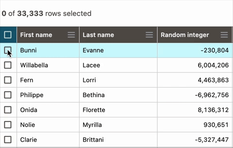
Create selection UI
To make row selection possible, we'll start by adding a new column specifically for selection controls. Within this column, each row gets its checkbox. In the column header, we'll place a main checkbox that acts as a select/deselect all control for the rows currently shown. It's important that the select all action respects filtering: if the user has filtered the data, this checkbox will only affect the visible, filtered rows.
Add selection column
We will extend src/DataTable/columnsConfig.tsx with a new column definition. columnHelper.display() is used to create a display-only table column (not mapped to any data). We assign the column an id selection and a width of 34 pixels.
export const columns = [
  columnHelper.display({
    id: 'selection',
    size: 34,
    cell: ({ row, column }) => {
      return (
        <div className="px-2" style={{ width: column.getSize() }}>
          <Checkbox
            className="text-primary"
            checked={row.getIsSelected()}
            disabled={!row.getCanSelect()}
            onChange={row.getToggleSelectedHandler()}
          />
        </div>
      );
    },
    // ...
  })
  // ...
]
Cell renderer component uses TanStack Row Selection API. row.getIsSelected() controls checked state; row.getCanSelect() allows developers to disable certain checkboxes (see below); row.getToggleSelectedHandler(): creates row selection toggle handler.
Checkbox
The main element we rely on for capturing selection is the src/DataTable/inputs/Checkbox.tsx component. We will use Headless UI and Phosphor Icons to create accessible input.
Here is the component interface. checked prop defines whether the checkbox is selected; indeterminate: enables partial selection state (used for select all when some items are selected); disabled: disallow interaction; onChange: callback to capture value changes.
export type Props = {
  checked: boolean;
  onChange: (value: boolean) => void;
  disabled: boolean;
  indeterminate: boolean;
  className?: string;
};
We will use the Checkbox component from Headless UI to handle logic. Within the component, a useMemo hook selects the appropriate Phosphor icon based on the checkbox's state. Additionally, the checkbox's color and cursor style are adjusted when it is disabled.
import { FC, useMemo } from 'react';
import { Checkbox as CheckboxHeadless } from '@headlessui/react';
import { Icon } from '../../Icon.tsx';
import classNames from 'classnames';

export const Checkbox: FC<Props> = ({
  checked,
  onChange,
  disabled,
  indeterminate = false,
  className,
}) => {
  const checkboxIcon = useMemo(() => {
    if (indeterminate) {
      return 'minus-square'
    } else if (checked) {
      return 'check-square'
    }
    return 'square'
  }, [checked, indeterminate])


  return (
    <CheckboxHeadless
      className={classNames(
        'flex items-center text-lg',
        {
          'cursor-not-allowed': disabled,
          'cursor-pointer': !disabled,
        },
        className,
      )}
      checked={checked}
      onChange={onChange}
      disabled={disabled}
      indeterminate={indeterminate}
    >
      <Icon
        name={checkboxIcon}
        variant="bold"
        className={classNames('shrink-0', {
          'text-disabledColor dark:text-primaryDark': disabled,
        })}
      />
    </CheckboxHeadless>
  );
};
And finally, we will make this column permanently pinned to the left side by providing initial pinning state to useReactTable hook at src/DataTable/DataTable.tsx.
const table = useReactTable({
    // ...
    initialState: {
      columnPinning: { left: ['selection'] },
    },
})
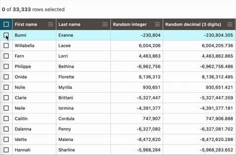
Selection info panel
First, we create a toolbar and adjust the scrollable area at src/DataTable/DataTable.tsx. h-[52px] Tailwind CSS class establishes a fixed height of 52 pixels.
Within this toolbar, the SelectionInfo component is rendered with three props:
-
locale: Passes the current locale for number formatting -
selected: The count of selected rows, obtained directly from the table's selection model (table.getSelectedRowModel().rows.length) -
total: The total row count before filtering, ensuring users know the total dataset size (table.getPreFilteredRowModel().rows.length)
<div className="flex h-[52px] items-center gap-1.5 p-1.5">
  <SelectionInfo
    locale={locale}
    selected={table.getSelectedRowModel().rows.length}
    total={table.getPreFilteredRowModel().rows.length}
  />
</div>
maxHeight: calc(100dvh - 52px) style property ensures the table container takes the available viewport height minus the toolbar height.
<div
  style={{
    maxHeight: 'calc(100dvh - 52px)',
  }}
  className="h-min max-w-full overflow-auto"
  ref={scrollRef}
>
//...
</div>
src/DataTable/SelectionInfo.tsx works with the selection column's header cell and individual row checkboxes. This panel gives users clear feedback about their selections, displaying how many rows are selected out of the total available.
We use Intl.NumberFormat to format numbers according to the specified locale. This ensures that numbers are displayed in the appropriate format (e.g., 1,234 in English vs 1.234 in German).
tabular-nums Tailwind CSS class ensures numbers are aligned properly when they change.
import { FC } from 'react';

export type Props = {
  total: number;
  selected: number;
  locale: string;
};

const formatRowsAmount = (amount: number, locale: string) =>
  new Intl.NumberFormat(locale, {
    style: 'decimal',
  }).format(amount);

export const SelectionInfo: FC<Props> =
  ({ total, selected, locale }) => {
  return (
    <div className="text-sm tabular-nums text-primary">
      <strong>{formatRowsAmount(selected, locale)}</strong> of{' '}
      <strong>{formatRowsAmount(total, locale)}</strong> rows selected
    </div>
  );
};
Exclude rows from selection

The Table selection API allows us to selectively exclude certain rows from selection. We access tableData prop and check if the randomDecimal value exceeds zero. This value is used by the Checkbox component in the selection cell through row.getCanSelect().
  const table = useReactTable({
    //...
    enableRowSelection: row => row.original.randomDecimal > 0,
  });
Demo
Here is a working demo of this exercise.
To be continued.


Top comments (0)