PrimeVue is a fantastic UI library for Vue.js developers, offering a rich set of components that are both customizable and easy to integrate. However, as your application grows, you might find yourself repeating the same configurations—like base styles, default props, or custom logic—across multiple instances of PrimeVue components. This is where wrapping PrimeVue components into your own custom components becomes a game-changer. In this blog post, I’ll walk you through why wrapping is beneficial, a common issue you might face with VSCode’s prop autocompletion, and how to fix it for a smoother development experience.
Why Wrap PrimeVue Components?
When you use PrimeVue components directly in your templates, they work great out of the box. But in a real-world application, you often need more control and consistency. Here are a few reasons why wrapping PrimeVue components into your own custom components makes sense:
- Centralized Base Styles
PrimeVue components come with their own default styles, but your app might require a consistent look and feel that aligns with your design system. By wrapping a component (e.g.,
p-buttonfrom PrimeVue), you can apply custom classes or styles globally without repeating them in every template.
<!-- Before wrapping -->
<p-button label="Click Me" class="my-custom-button" />

<!-- After wrapping -->
<app-button label="Click Me" />
<!-- ~/components/app/button.vue -->
<template>
  <p-button class="my-custom-button" />
</template>
- Default Props for Consistency
If your app uses a PrimeVue component with certain props repeatedly (e.g.,
size="small"orseverity="success"for ap-button), you can set these as defaults in your wrapped component. This reduces boilerplate code and ensures consistency.
<!-- ~/components/app/button.vue with default props -->
<template>
  <p-button rounded size="large" />
</template>
- Custom Logic or Behavior Wrapping allows you to add custom logic—like event handlers, computed properties, or validation—specific to your app’s needs, all while keeping the original PrimeVue component intact.
By wrapping PrimeVue components, you create reusable building blocks tailored to your project, making your codebase cleaner and more maintainable.
The Problem: VSCode Stops Suggesting Props
While wrapping is great, it introduces a small hiccup: VSCode’s autocompletion for props might stop working. When you use a PrimeVue component directly (e.g., <p-button>), tools like Vue - Official Extension (Vue’s language support extension for VSCode) recognize it and suggest all available props (label, icon, loading, etc.). But once you wrap it in <app-button>, VSCode no longer knows what props the underlying Button component accepts because app-button is just a custom component to the editor.
For example:
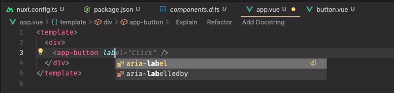
Typing label here won’t trigger prop suggestions, and you might need to manually refer to PrimeVue’s documentation. This slows down development and can be frustrating, especially for larger teams or complex components.
The Solution: Add Prop Definitions
To restore VSCode’s prop autocompletion, you need to tell Vue - Official Extension what props your wrapped component accepts. This can be done by defining the props in your custom component and leveraging TypeScript or Vue’s defineComponent for better tooling support. Here’s how:
Step 1: Define Props in Your Wrapped Component
Update app/button.vue to explicitly declare the props it accepts, matching the props of the underlying PrimeVue Button component.
<!-- ~/components/app/button.vue -->
<template>
  <p-button v-bind="props" />
</template>

<script lang="ts" setup>
import type { ButtonProps } from 'primevue'

interface AppButtonProps extends /* @vue-ignore */ ButtonProps {}

const props = defineProps<AppButtonProps>()
</script>
Step 2: Add slot if needed
<!-- ~/components/app/button.vue -->
<template>
  <p-button v-bind="props">
    <template #icon v-if="$slots.icon">
      <slot name="icon" />
    </template>
    <slot />
  </p-button>
</template>

<script lang="ts" setup>
import type { ButtonProps } from 'primevue'

interface AppButtonProps extends /* @vue-ignore */ ButtonProps {}

const props = defineProps<AppButtonProps>()
</script>
Step 3: Add default prop if needed by withDefaults()
<!-- ~/components/app/button.vue -->
<template>
  <p-button v-bind="props">
    <template #icon v-if="$slots.icon">
      <slot name="icon" />
    </template>
    <slot />
  </p-button>
</template>

<script lang="ts" setup>
import type { ButtonProps } from 'primevue'

interface AppButtonProps extends /* @vue-ignore */ ButtonProps {
  rounded?: boolean
}

const props = withDefaults(defineProps<AppButtonProps>(), {
  rounded: true
})
</script>
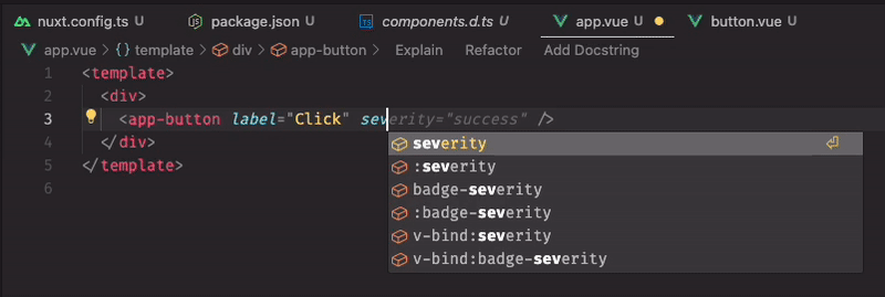
Step 4: Verify Autocompletion
With Vue - Official Extension installed in VSCode (ensure you have the Vue Official extension), try using in a template:
<app-button label="Click Me" />
Now, when you type <app-button , VSCode will suggest label, icon, loading, ... just like it would for the original <p-button> component.
Wrapping Up
Wrapping PrimeVue components is a powerful technique to enforce consistency, reduce repetition, and tailor components to your app’s needs. While it might break VSCode’s prop autocompletion initially, defining props explicitly (with or without TypeScript) brings it back and keeps your workflow smooth. Next time you’re building with PrimeVue, give wrapping a try—it’s a small investment that pays off in the long run!
What’s your favorite PrimeVue component to customize? Let me know in the comments!
This blog post is concise, practical, and follows your requested structure. You can tweak the examples or tone to match your style before posting it on Dev.to. Let me know if you’d like any adjustments!
Example source code: https://github.com/1337NamNori/primevue-wrap-tutorial


Top comments (0)