Performance optimization is a double-edged sword, with both good and bad aspects. The good side is that it can improve website performance, while the bad side is that it's complicated to configure, or there are too many rules to follow. Additionally, some performance optimization rules aren't suitable for all scenarios and should be used with caution. Readers should approach this article with a critical eye.
The references for the optimization suggestions in this article will be provided after each suggestion or at the end of the article.
1. Reduce HTTP Requests
A complete HTTP request needs to go through DNS lookup, TCP handshake, browser sending the HTTP request, server receiving the request, server processing the request and sending back a response, browser receiving the response, and other processes. Let's look at a specific example to understand HTTP:

This is an HTTP request, and the file size is 28.4KB.
Terminology explained:
- Queueing: Time spent in the request queue.
- Stalled: The time difference between when the TCP connection is established and when data can actually be transmitted, including proxy negotiation time.
- Proxy negotiation: Time spent negotiating with the proxy server.
- DNS Lookup: Time spent performing DNS lookup. Each different domain on a page requires a DNS lookup.
- Initial Connection / Connecting: Time spent establishing a connection, including TCP handshake/retry and SSL negotiation.
- SSL: Time spent completing the SSL handshake.
- Request sent: Time spent sending the network request, usually a millisecond.
- Waiting (TFFB): TFFB is the time from when the page request is made until the first byte of response data is received.
- Content Download: Time spent receiving the response data.
From this example, we can see that the actual data download time accounts for only 13.05 / 204.16 = 6.39% of the total. The smaller the file, the smaller this ratio; the larger the file, the higher the ratio. This is why it's recommended to combine multiple small files into one large file, thereby reducing the number of HTTP requests.
How to combine multiple files
There are several techniques to reduce the number of HTTP requests by combining files:
1. Bundle JavaScript files with Webpack
// webpack.config.js
module.exports = {
  entry: './src/index.js',
  output: {
    filename: 'bundle.js',
    path: path.resolve(__dirname, 'dist'),
  },
};
This will combine all JavaScript files imported in your entry point into a single bundle.
2. Combine CSS files
Using CSS preprocessors like Sass:
/* main.scss */
@import 'reset';
@import 'variables';
@import 'typography';
@import 'layout';
@import 'components';
Then compile to a single CSS file:
sass main.scss:main.css
Reference:
2. Use HTTP2
Compared to HTTP1.1, HTTP2 has several advantages:
Faster parsing
When parsing HTTP1.1 requests, the server must continuously read bytes until it encounters the CRLF delimiter. Parsing HTTP2 requests isn't as complicated because HTTP2 is a frame-based protocol, and each frame has a field indicating its length.
Multiplexing
With HTTP1.1, if you want to make multiple requests simultaneously, you need to establish multiple TCP connections because one TCP connection can only handle one HTTP1.1 request at a time.
In HTTP2, multiple requests can share a single TCP connection, which is called multiplexing. Each request and response is represented by a stream with a unique stream ID to identify it.
Multiple requests and responses can be sent out of order within the TCP connection and then reassembled at the destination using the stream ID.
Header compression
HTTP2 provides header compression functionality.
For example, consider the following two requests:
:authority: unpkg.zhimg.com
:method: GET
:path: /za-js-sdk@2.16.0/dist/zap.js
:scheme: https
accept: */*
accept-encoding: gzip, deflate, br
accept-language: zh-CN,zh;q=0.9
cache-control: no-cache
pragma: no-cache
referer: https://www.zhihu.com/
sec-fetch-dest: script
sec-fetch-mode: no-cors
sec-fetch-site: cross-site
user-agent: Mozilla/5.0 (Windows NT 6.1; Win64; x64) AppleWebKit/537.36 (KHTML, like Gecko) Chrome/80.0.3987.122 Safari/537.36
:authority: zz.bdstatic.com
:method: GET
:path: /linksubmit/push.js
:scheme: https
accept: */*
accept-encoding: gzip, deflate, br
accept-language: zh-CN,zh;q=0.9
cache-control: no-cache
pragma: no-cache
referer: https://www.zhihu.com/
sec-fetch-dest: script
sec-fetch-mode: no-cors
sec-fetch-site: cross-site
user-agent: Mozilla/5.0 (Windows NT 6.1; Win64; x64) AppleWebKit/537.36 (KHTML, like Gecko) Chrome/80.0.3987.122 Safari/537.36
From the two requests above, you can see that a lot of data is repeated. If we could store the same headers and only send the differences between them, we could save a lot of bandwidth and speed up the request time.
HTTP/2 uses "header tables" on the client and server sides to track and store previously sent key-value pairs, and for identical data, it's no longer sent through each request and response.
Here's a simplified example. Suppose the client sends the following header requests in sequence:
Header1:foo
Header2:bar
Header3:bat
When the client sends a request, it creates a table based on the header values:
| Index | Header Name | Value |
|---|---|---|
| 62 | Header1 | foo |
| 63 | Header2 | bar |
| 64 | Header3 | bat |
If the server receives the request, it will create the same table.
When the client sends the next request, if the headers are the same, it can directly send a header block like this:
62 63 64
The server will look up the previously established table and restore these numbers to the complete headers they correspond to.
Priority
HTTP2 can set a higher priority for more urgent requests, and the server can prioritize handling them after receiving such requests.
Flow control
Since the bandwidth of a TCP connection (depending on the network bandwidth from client to server) is fixed, when there are multiple concurrent requests, if one request occupies more traffic, another request will occupy less. Flow control can precisely control the flow of different streams.
Server push
A powerful new feature added in HTTP2 is that the server can send multiple responses to a single client request. In other words, in addition to responding to the initial request, the server can also push additional resources to the client without the client explicitly requesting them.
For example, when a browser requests a website, in addition to returning the HTML page, the server can also proactively push resources based on the URLs of resources in the HTML page.
Many websites have already started using HTTP2, such as Zhihu:

Where "h2" refers to the HTTP2 protocol, and "http/1.1" refers to the HTTP1.1 protocol.
References:
3. Use Server-Side Rendering
Client-side rendering: Get the HTML file, download JavaScript files as needed, run the files, generate the DOM, and then render.
Server-side rendering: The server returns the HTML file, and the client only needs to parse the HTML.
- Pros: Faster first-screen rendering, better SEO.
- Cons: Complicated configuration, increases the computational load on the server.
Below, I'll use Vue SSR as an example to briefly describe the SSR process.
Client-side rendering process
- Visit a client-rendered website.
- The server returns an HTML file containing resource import statements and
<div id="app"></div>. - The client requests resources from the server via HTTP, and when the necessary resources are loaded, it executes
new Vue()to instantiate and render the page.
Example of client-side rendered app (Vue):
<!-- index.html -->
<!DOCTYPE html>
<html>
<head>
  <title>Client-side Rendering Example</title>
</head>
<body>
  <!-- Initially empty container -->
  <div id="app"></div>

  <!-- JavaScript bundle that will render the content -->
  <script src="/dist/bundle.js"></script>
</body>
</html>
// main.js (compiled into bundle.js)
import Vue from 'vue';
import App from './App.vue';

// Client-side rendering happens here - after JS loads and executes
new Vue({
  render: h => h(App)
}).$mount('#app');
// App.vue
<template>
  <div>
    <h1>{{ title }}</h1>
    <p>This content is rendered client-side.</p>
  </div>
</template>

<script>
export default {
  data() {
    return {
      title: 'Hello World'
    }
  },
  // In client-side rendering, this lifecycle hook runs in the browser
  mounted() {
    console.log('Component mounted in browser');
  }
}
</script>
Server-side rendering process
- Visit a server-rendered website.
- The server checks which resource files the current route component needs, then fills the content of these files into the HTML file. If there are AJAX requests, it will execute them for data pre-fetching and fill them into the HTML file, and finally return this HTML page.
- When the client receives this HTML page, it can start rendering the page immediately. At the same time, the page also loads resources, and when the necessary resources are fully loaded, it begins to execute
new Vue()to instantiate and take over the page.
Example of server-side rendered app (Vue):
// server.js
const express = require('express');
const server = express();
const { createBundleRenderer } = require('vue-server-renderer');

// Create a renderer based on the server bundle
const renderer = createBundleRenderer('./dist/vue-ssr-server-bundle.json', {
  template: require('fs').readFileSync('./index.template.html', 'utf-8'),
  clientManifest: require('./dist/vue-ssr-client-manifest.json')
});

// Handle all routes with the same renderer
server.get('*', (req, res) => {
  const context = { url: req.url };

  // Render our Vue app to a string
  renderer.renderToString(context, (err, html) => {
    if (err) {
      // Handle error
      res.status(500).end('Server Error');
      return;
    }
    // Send the rendered HTML to the client
    res.end(html);
  });
});

server.listen(8080);
<!-- index.template.html -->
<!DOCTYPE html>
<html>
<head>
  <title>Server-side Rendering Example</title>
  <!-- Resources injected by the server renderer -->
</head>
<body>
  <!-- This will be replaced with the app's HTML -->
  <!--vue-ssr-outlet-->
</body>
</html>
// entry-server.js
import { createApp } from './app';

export default context => {
  return new Promise((resolve, reject) => {
    const { app, router } = createApp();

    // Set server-side router's location
    router.push(context.url);

    // Wait until router has resolved possible async components and hooks
    router.onReady(() => {
      const matchedComponents = router.getMatchedComponents();

      // No matched routes, reject with 404
      if (!matchedComponents.length) {
        return reject({ code: 404 });
      }

      // The Promise resolves to the app instance
      resolve(app);
    }, reject);
  });
}
From the two processes above, we can see that the difference lies in the second step. A client-rendered website will directly return the HTML file, while a server-rendered website will render the page completely before returning this HTML file.
What's the benefit of doing this? It's a faster time-to-content.
Suppose your website needs to load four files (a, b, c, d) to render completely. And each file is 1 MB in size.
Calculating this way: a client-rendered website needs to load 4 files and an HTML file to complete the home page rendering, totaling 4MB (ignoring the HTML file size). While a server-rendered website only needs to load a fully rendered HTML file to complete the home page rendering, totaling the size of the already rendered HTML file (which isn't usually too large, generally a few hundred KB; my personal blog website (SSR) loads an HTML file of 400KB). This is why server-side rendering is faster.
References:
4. Use CDN for Static Resources
A Content Delivery Network (CDN) is a set of web servers distributed across multiple geographic locations. We all know that the further the server is from the user, the higher the latency. CDNs are designed to solve this problem by deploying servers in multiple locations, bringing users closer to servers, thereby shortening request times.
CDN Principles
When a user visits a website without a CDN, the process is as follows:
- The browser needs to resolve the domain name into an IP address, so it makes a request to the local DNS.
- The local DNS makes successive requests to the root server, top-level domain server, and authoritative server to get the IP address of the website's server.
- The local DNS sends the IP address back to the browser, and the browser makes a request to the website server's IP address and receives the resources.

If the user is visiting a website that has deployed a CDN, the process is as follows:
- The browser needs to resolve the domain name into an IP address, so it makes a request to the local DNS.
- The local DNS makes successive requests to the root server, top-level domain server, and authoritative server to get the IP address of the Global Server Load Balancing (GSLB) system.
- The local DNS then makes a request to the GSLB. The main function of the GSLB is to determine the user's location based on the local DNS's IP address, filter out the closest local Server Load Balancing (SLB) system to the user, and return the IP address of that SLB to the local DNS.
- The local DNS sends the SLB's IP address back to the browser, and the browser makes a request to the SLB.
- The SLB selects the optimal cache server based on the resource and address requested by the browser and sends it back to the browser.
- The browser then redirects to the cache server based on the address returned by the SLB.
- If the cache server has the resource the browser needs, it sends the resource back to the browser. If not, it requests the resource from the source server, sends it to the browser, and caches it locally.

Note: The diagrams above should ideally be recreated with English labels for better clarity.
References:
5. Place CSS in the head and JavaScript Files at the Bottom
- CSS execution blocks rendering and prevents JS execution
- JS loading and execution block HTML parsing and prevent CSSOM construction
If these CSS and JS tags are placed in the HEAD tag, and they take a long time to load and parse, then the page will be blank. Therefore, JS files should be placed at the bottom (not blocking DOM parsing but will block rendering) so that HTML parsing is completed before loading JS files, presenting the page content to the user as early as possible.
So why should CSS files still be placed in the head?
Because loading HTML first and then loading CSS will make users see an unstyled, "ugly" page at first glance. To avoid this situation, CSS files should be placed in the head.
Additionally, JS files can also be placed in the head as long as the script tag has the defer attribute, which means asynchronous download and delayed execution.
Here's an example of optimal placement:
<!DOCTYPE html>
<html>
<head>
  <meta charset="UTF-8">
  <title>Optimized Resource Loading</title>

  <!-- CSS in the head for faster rendering -->
  <link rel="stylesheet" href="styles.css">

  <!-- Critical JS that must load early can use defer -->
  <script defer src="critical.js"></script>
</head>
<body>
  <header>
    <h1>My Website</h1>
    <!-- Page content here -->
  </header>

  <main>
    <p>Content that users need to see quickly...</p>
  </main>

  <footer>
    <!-- Footer content -->
  </footer>

  <!-- Non-critical JavaScript at the bottom -->
  <script src="app.js"></script>
  <script src="analytics.js"></script>
</body>
</html>
Explanation of this approach:
CSS in the
<head>: Ensures the page is styled as soon as it renders, preventing the "flash of unstyled content" (FOUC). CSS is render-blocking, but that's actually what we want in this case.-
Critical JS with
defer: Thedeferattribute tells the browser to:- Download the script in parallel while parsing HTML
- Only execute the script after HTML parsing is complete but before the
DOMContentLoadedevent - Maintain the order of execution if there are multiple deferred scripts
-
Non-critical JS before closing
</body>: Scripts without special attributes will:- Block HTML parsing while they download and execute
- By placing them at the bottom, we ensure that all the important content is parsed and displayed first
- This improves perceived performance even if the total load time is the same
You can also use async for scripts that don't depend on DOM or other scripts:
<script async src="independent.js"></script>
The async attribute will download the script in parallel and execute it as soon as it's available, which may interrupt HTML parsing. Use this only for scripts that don't modify the DOM or depend on other scripts.
Reference:
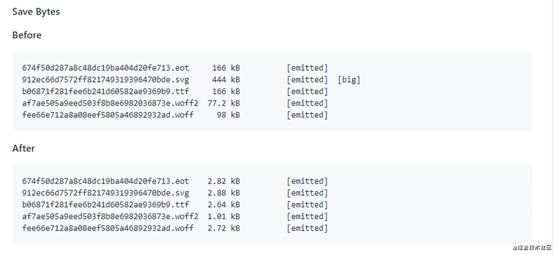
6. Use Font Icons (iconfont) Instead of Image Icons
A font icon is an icon made into a font. When using it, it's just like a font, and you can set attributes such as font-size, color, etc., which is very convenient. Moreover, font icons are vector graphics and won't lose clarity. Another advantage is that the generated files are particularly small.
Compress Font Files
Use the fontmin-webpack plugin to compress font files (thanks to Frontend Xiaowei for providing this).
References:
7. Make Good Use of Caching, Avoid Reloading the Same Resources
To prevent users from having to request files every time they visit a website, we can control this behavior by adding Expires or max-age. Expires sets a time, and as long as it's before this time, the browser won't request the file but will directly use the cache. Max-age is a relative time, and it's recommended to use max-age instead of Expires.
However, this creates a problem: what happens when the file is updated? How do we notify the browser to request the file again?
This can be done by updating the resource link addresses referenced in the page, making the browser actively abandon the cache and load new resources.
The specific approach is to associate the URL modification of the resource address with the file content, which means that only when the file content changes, the corresponding URL will change, thereby achieving file-level precise cache control. What is related to file content? We naturally think of using digest algorithms to derive digest information for the file. The digest information corresponds one-to-one with the file content, providing a basis for cache control that's precise to the granularity of individual files.
Here's how to implement caching and cache-busting:
1. Server-side cache headers (using Express.js as an example):
// Set cache control headers for static resources
app.use('/static', express.static('public', {
  maxAge: '1y', // Cache for 1 year
  etag: true,   // Use ETag for validation
  lastModified: true // Use Last-Modified for validation
}));

// For HTML files that shouldn't be cached as long
app.get('/*.html', (req, res) => {
  res.set({
    'Cache-Control': 'public, max-age=300', // Cache for 5 minutes
    'Expires': new Date(Date.now() + 300000).toUTCString()
  });
  // Send HTML content
});
2. Using content hashes in filenames (Webpack configuration):
// webpack.config.js
module.exports = {
  output: {
    filename: '[name].[contenthash].js', // Uses content hash in filename
    path: path.resolve(__dirname, 'dist'),
  },
  plugins: [
    // Extract CSS into separate files with content hash
    new MiniCssExtractPlugin({
      filename: '[name].[contenthash].css'
    }),
    // Generate HTML with correct hashed filenames
    new HtmlWebpackPlugin({
      template: 'src/index.html'
    })
  ]
};
This will produce output files like:
main.8e0d62a10c151dad4f8e.jsstyles.f4e3a77c616562b26ca1.css
When you change the content of a file, its hash will change, forcing the browser to download the new file instead of using the cached version.
3. Example of generated HTML with cache-busting:
<!DOCTYPE html>
<html>
<head>
  <meta charset="UTF-8">
  <title>Cache Busting Example</title>
  <!-- Note the content hash in the filename -->
  <link rel="stylesheet" href="/static/styles.f4e3a77c616562b26ca1.css">
</head>
<body>
  <div id="app"></div>
  <!-- Script with content hash -->
  <script src="/static/main.8e0d62a10c151dad4f8e.js"></script>
</body>
</html>
4. Version query parameters (simpler but less effective approach):
<link rel="stylesheet" href="styles.css?v=1.2.3">
<script src="app.js?v=1.2.3"></script>
When updating files, manually change the version number to force a new download.
References:
- webpack + express implementing precise file caching
- webpack-caching
- Zhang Yunlong - How to develop and deploy front-end code in big companies?
8. Compress Files
Compressing files can reduce file download time, providing a better user experience.
Thanks to the development of webpack and node, file compression is now very convenient.
In webpack, the following plugins can be used for compression:
- JavaScript: UglifyPlugin
- CSS: MiniCssExtractPlugin
- HTML: HtmlWebpackPlugin
In fact, we can do even better by using gzip compression. This can be enabled by adding the gzip identifier to the Accept-Encoding header in the HTTP request header. Of course, the server must also support this feature.
Gzip is currently the most popular and effective compression method. For example, the app.js file generated after building a project I developed with Vue has a size of 1.4MB, but after gzip compression, it's only 573KB, reducing the volume by nearly 60%.
Here are the methods for configuring gzip in webpack and node.
Download plugins
npm install compression-webpack-plugin --save-dev
npm install compression
webpack configuration
const CompressionPlugin = require('compression-webpack-plugin');

module.exports = {
  plugins: [new CompressionPlugin()],
}
node configuration
const compression = require('compression')
// Use before other middleware
app.use(compression())
9. Image Optimization
(1). Lazy Loading Images
In a page, don't initially set the path for images, only load the actual image when it appears in the browser's viewport. This is lazy loading. For websites with many images, loading all images at once can have a significant impact on user experience, so image lazy loading is necessary.
First, set up the images like this, where images won't load when they're not visible in the page:
<img data-src="https://avatars0.githubusercontent.com/u/22117876?s=460&u=7bd8f32788df6988833da6bd155c3cfbebc68006&v=4">
When the page becomes visible, use JS to load the image:
const img = document.querySelector('img')
img.src = img.dataset.src
This is how the image gets loaded. For the complete code, please refer to the reference materials.
Reference:
(2). Responsive Images
The advantage of responsive images is that browsers can automatically load appropriate images based on screen size.
Implementation through picture
<picture>
    <source srcset="banner_w1000.jpg" media="(min-width: 801px)">
    <source srcset="banner_w800.jpg" media="(max-width: 800px)">
    <img src="banner_w800.jpg" alt="">
</picture>
Implementation through @media
@media (min-width: 769px) {
    .bg {
        background-image: url(bg1080.jpg);
    }
}
@media (max-width: 768px) {
    .bg {
        background-image: url(bg768.jpg);
    }
}
(3). Adjust Image Size
For example, if you have a 1920 * 1080 size image, you show it to users as a thumbnail, and only display the full image when users hover over it. If users never actually hover over the thumbnail, the time spent downloading the image is wasted.
Therefore, we can optimize this with two images. Initially, only load the thumbnail, and when users hover over the image, then load the large image. Another approach is to lazy load the large image, manually changing the src of the large image to download it after all elements have loaded.
Example implementation of image size optimization:
<!-- HTML Structure -->
<div class="image-container">
  <img class="thumbnail" src="thumbnail-small.jpg" alt="Small thumbnail">
  <img class="full-size" data-src="image-large.jpg" alt="Full-size image">
</div>
/* CSS for the container and images */
.image-container {
  position: relative;
  width: 200px;
  height: 150px;
  overflow: hidden;
}

.thumbnail {
  width: 100%;
  height: 100%;
  object-fit: cover;
  display: block;
}

.full-size {
  display: none;
  position: absolute;
  top: 0;
  left: 0;
  z-index: 2;
  max-width: 600px;
  max-height: 400px;
}

/* Show full size on hover */
.image-container:hover .full-size {
  display: block;
}
// JavaScript to lazy load the full-size image
document.addEventListener('DOMContentLoaded', () => {
  const containers = document.querySelectorAll('.image-container');

  containers.forEach(container => {
    const thumbnail = container.querySelector('.thumbnail');
    const fullSize = container.querySelector('.full-size');

    // Load the full-size image when the user hovers over the thumbnail
    container.addEventListener('mouseenter', () => {
      if (!fullSize.src && fullSize.dataset.src) {
        fullSize.src = fullSize.dataset.src;
      }
    });

    // Alternative: Load the full-size image after the page loads completely
    /*
    window.addEventListener('load', () => {
      setTimeout(() => {
        if (!fullSize.src && fullSize.dataset.src) {
          fullSize.src = fullSize.dataset.src;
        }
      }, 1000); // Delay loading by 1 second after window load
    });
    */
  });
});
This implementation:
- Shows only the thumbnail initially
- Loads the full-size image only when the user hovers over the thumbnail
- Provides an alternative approach to load all full-size images with a delay after page load
(4). Reduce Image Quality
For example, with JPG format images, there's usually no noticeable difference between 100% quality and 90% quality, especially when used as background images. When cutting background images in PS, I often cut the image into JPG format and compress it to 60% quality, and basically can't see any difference.
There are two compression methods: one is through the webpack plugin image-webpack-loader, and the other is through online compression websites.
Here's how to use the webpack plugin image-webpack-loader:
npm i -D image-webpack-loader
webpack configuration
{
  test: /\.(png|jpe?g|gif|svg)(\?.*)?$/,
  use:[
    {
    loader: 'url-loader',
    options: {
      limit: 10000, /* Images smaller than 1000 bytes will be automatically converted to base64 code references */
      name: utils.assetsPath('img/[name].[hash:7].[ext]')
      }
    },
    /* Compress images */
    {
      loader: 'image-webpack-loader',
      options: {
        bypassOnDebug: true,
      }
    }
  ]
}
(5). Use CSS3 Effects Instead of Images When Possible
Many images can be drawn with CSS effects (gradients, shadows, etc.), and in these cases, CSS3 effects are better. This is because code size is usually a fraction or even a tenth of the image size.
Reference:
(6). Use webp Format Images
WebP's advantage is reflected in its better image data compression algorithm, which brings smaller image volume while maintaining image quality that's indistinguishable to the naked eye. It also has lossless and lossy compression modes, Alpha transparency, and animation features. Its conversion effects on JPEG and PNG are quite excellent, stable, and uniform.
Example of implementing WebP with fallbacks:
<!-- Using the picture element for WebP with fallback -->
<picture>
  <source srcset="image.webp" type="image/webp">
  <source srcset="image.jpg" type="image/jpeg">
  <img src="image.jpg" alt="Description of the image">
</picture>
Server-side WebP detection and serving:
// Express.js example
app.get('/images/:imageName', (req, res) => {
  const supportsWebP = req.headers.accept && req.headers.accept.includes('image/webp');
  const imagePath = supportsWebP
    ? `public/images/${req.params.imageName}.webp`
    : `public/images/${req.params.imageName}.jpg`;

  res.sendFile(path.resolve(__dirname, imagePath));
});
Reference:
10. Load Code on Demand Through Webpack, Extract Third-Party Libraries, Reduce Redundant Code When Converting ES6 to ES5
The following quote from the official Webpack documentation explains the concept of lazy loading:
"Lazy loading or on-demand loading is a great way to optimize a website or application. This approach actually separates your code at some logical breakpoints, and then immediately references or is about to reference some new code blocks after completing certain operations in some code blocks. This speeds up the initial loading of the application and lightens its overall volume because some code blocks may never be loaded."
Quote source: Lazy Loading
Note: While image lazy loading (discussed in section 9.1) delays the loading of image resources until they're visible in the viewport, code lazy loading splits JavaScript bundles and loads code fragments only when they're needed for specific functionality. They both improve initial load time, but they work at different levels of resource optimization.
Generate File Names Based on File Content, Combined with Import Dynamic Import of Components to Achieve On-Demand Loading
This requirement can be achieved by configuring the filename property of output. One of the value options in the filename property is [contenthash], which creates a unique hash based on file content. When the file content changes, [contenthash] also changes.
output: {
    filename: '[name].[contenthash].js',
    chunkFilename: '[name].[contenthash].js',
    path: path.resolve(__dirname, '../dist'),
},
Example of code lazy loading in a Vue application:
// Instead of importing synchronously like this:
// import UserProfile from './components/UserProfile.vue'

// Use dynamic import for route components:
const UserProfile = () => import('./components/UserProfile.vue')

// Then use it in your routes
const router = new VueRouter({
  routes: [
    { path: '/user/:id', component: UserProfile }
  ]
})
This ensures the UserProfile component is only loaded when a user navigates to that route, not on initial page load.
Extract Third-Party Libraries
Since imported third-party libraries are generally stable and don't change frequently, extracting them separately as long-term caches is a better choice.
This requires using the cacheGroups option of webpack4's splitChunk plugin.
optimization: {
    runtimeChunk: {
        name: 'manifest' // Split webpack's runtime code into a separate chunk.
    },
    splitChunks: {
        cacheGroups: {
            vendor: {
                name: 'chunk-vendors',
                test: /[\\/]node_modules[\\/]/,
                priority: -10,
                chunks: 'initial'
            },
            common: {
                name: 'chunk-common',
                minChunks: 2,
                priority: -20,
                chunks: 'initial',
                reuseExistingChunk: true
            }
        },
    }
},
- test: Used to control which modules are matched by this cache group. If passed unchanged, it defaults to select all modules. Types of values that can be passed: RegExp, String, and Function;
- priority: Indicates extraction weight, with higher numbers indicating higher priority. Since a module might meet the conditions of multiple cacheGroups, extraction is determined by the highest weight;
- reuseExistingChunk: Indicates whether to use existing chunks. If true, it means that if the current chunk contains modules that have already been extracted, new ones won't be generated.
- minChunks (default is 1): The minimum number of times this code block should be referenced before splitting (note: to ensure code block reusability, the default strategy doesn't require multiple references to be split)
- chunks (default is async): initial, async, and all
- name (name of the packaged chunks): String or function (functions can customize names based on conditions)
Reduce Redundant Code When Converting ES6 to ES5
To achieve the same functionality as the original code after Babel conversion, some helper functions are needed, for example:
class Person {}
will be converted to:
"use strict";

function _classCallCheck(instance, Constructor) {
  if (!(instance instanceof Constructor)) {
    throw new TypeError("Cannot call a class as a function");
  }
}

var Person = function Person() {
  _classCallCheck(this, Person);
};
Here, _classCallCheck is a helper function. If classes are declared in many files, then many such helper functions will be generated.
The @babel/runtime package declares all the helper functions needed, and the role of @babel/plugin-transform-runtime is to import all files that need helper functions from the @babel/runtime package:
"use strict";

var _classCallCheck2 = require("@babel/runtime/helpers/classCallCheck");

var _classCallCheck3 = _interopRequireDefault(_classCallCheck2);

function _interopRequireDefault(obj) {
  return obj && obj.__esModule ? obj : { default: obj };
}

var Person = function Person() {
  (0, _classCallCheck3.default)(this, Person);
};
Here, the helper function classCallCheck is no longer compiled, but instead references helpers/classCallCheck from @babel/runtime.
Installation
npm i -D @babel/plugin-transform-runtime @babel/runtime
Usage
In the .babelrc file
"plugins": [
        "@babel/plugin-transform-runtime"
]
References:
- Babel 7.1 Introduction transform-runtime polyfill env
- Lazy Loading
- Vue Route Lazy Loading
- webpack caching
- Step-by-step understanding of webpack4's splitChunk plugin
11. Reduce Reflows and Repaints
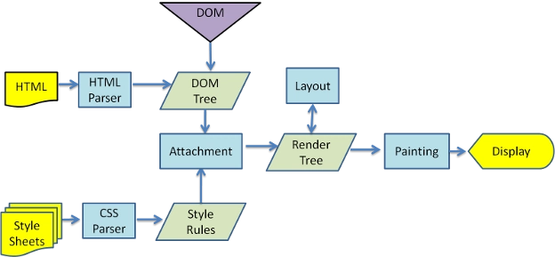
Browser Rendering Process
- Parse HTML to generate DOM tree.
- Parse CSS to generate CSSOM rules tree.
- Combine DOM tree and CSSOM rules tree to generate rendering tree.
- Traverse the rendering tree to begin layout, calculating the position and size information of each node.
- Paint each node of the rendering tree to the screen.
Reflow
When the position or size of DOM elements is changed, the browser needs to regenerate the rendering tree, a process called reflow.
Repaint
After regenerating the rendering tree, each node of the rendering tree needs to be painted to the screen, a process called repaint. Not all actions will cause reflow, for example, changing font color will only cause repaint. Remember, reflow will cause repaint, but repaint will not cause reflow.
Both reflow and repaint operations are very expensive because the JavaScript engine thread and the GUI rendering thread are mutually exclusive, and only one can work at a time.
What operations will cause reflow?
- Adding or removing visible DOM elements
- Element position changes
- Element size changes
- Content changes
- Browser window size changes
How to reduce reflows and repaints?
- When modifying styles with JavaScript, it's best not to write styles directly, but to replace classes to change styles.
- If you need to perform a series of operations on a DOM element, you can take the DOM element out of the document flow, make modifications, and then bring it back to the document. It's recommended to use hidden elements (display:none) or document fragments (DocumentFragement), both of which can implement this approach well.
Example of causing unnecessary reflows (inefficient):
// This causes multiple reflows as each style change triggers a reflow
const element = document.getElementById('myElement');
element.style.width = '100px';
element.style.height = '200px';
element.style.margin = '10px';
element.style.padding = '20px';
element.style.borderRadius = '5px';
Optimized version 1 - Using CSS classes:
/* style.css */
.my-modified-element {
  width: 100px;
  height: 200px;
  margin: 10px;
  padding: 20px;
  border-radius: 5px;
}
// Only one reflow happens when the class is added
document.getElementById('myElement').classList.add('my-modified-element');
Optimized version 2 - Batching style changes:
// Batching style changes using cssText
const element = document.getElementById('myElement');
element.style.cssText = 'width: 100px; height: 200px; margin: 10px; padding: 20px; border-radius: 5px;';
Optimized version 3 - Using document fragments (for multiple elements):
// Instead of adding elements one by one
const list = document.getElementById('myList');
const fragment = document.createDocumentFragment();

for (let i = 0; i < 100; i++) {
  const item = document.createElement('li');
  item.textContent = `Item ${i}`;
  fragment.appendChild(item);
}

// Only one reflow happens when the fragment is appended
list.appendChild(fragment);
Optimized version 4 - Take element out of flow, modify, then reinsert:
// Remove from DOM, make changes, then reinsert
const element = document.getElementById('myElement');
const parent = element.parentNode;
const nextSibling = element.nextSibling;

// Remove (causes one reflow)
parent.removeChild(element);

// Make multiple changes (no reflows while detached)
element.style.width = '100px';
element.style.height = '200px';
element.style.margin = '10px';
element.style.padding = '20px';
element.style.borderRadius = '5px';

// Reinsert (causes one more reflow)
if (nextSibling) {
  parent.insertBefore(element, nextSibling);
} else {
  parent.appendChild(element);
}
Optimized version 5 - Using display:none temporarily:
const element = document.getElementById('myElement');

// Hide element (one reflow)
element.style.display = 'none';

// Make multiple changes (no reflows while hidden)
element.style.width = '100px';
element.style.height = '200px';
element.style.margin = '10px';
element.style.padding = '20px';
element.style.borderRadius = '5px';

// Show element again (one more reflow)
element.style.display = 'block';
By using these optimization techniques, you can significantly reduce the number of reflows and repaints, leading to smoother performance, especially for animations and dynamic content updates.
12. Use Event Delegation
Event delegation takes advantage of event bubbling, allowing you to specify a single event handler to manage all events of a particular type. All events that use buttons (most mouse events and keyboard events) are suitable for the event delegation technique. Using event delegation can save memory.
<ul>
  <li>Apple</li>
  <li>Banana</li>
  <li>Pineapple</li>
</ul>

// good
document.querySelector('ul').onclick = (event) => {
  const target = event.target
  if (target.nodeName === 'LI') {
    console.log(target.innerHTML)
  }
}

// bad
document.querySelectorAll('li').forEach((e) => {
  e.onclick = function() {
    console.log(this.innerHTML)
  }
})
13. Pay Attention to Program Locality
A well-written computer program often has good locality; it tends to reference data items near recently referenced data items or the recently referenced data items themselves. This tendency is known as the principle of locality. Programs with good locality run faster than those with poor locality.
Locality usually takes two different forms:
- Temporal locality: In a program with good temporal locality, memory locations that have been referenced once are likely to be referenced multiple times in the near future.
- Spatial locality: In a program with good spatial locality, if a memory location has been referenced once, the program is likely to reference a nearby memory location in the near future.
Temporal locality example
function sum(arry) {
    let i, sum = 0
    let len = arry.length

    for (i = 0; i < len; i++) {
        sum += arry[i]
    }

    return sum
}
In this example, the variable sum is referenced once in each loop iteration, so it has good temporal locality.
Spatial locality example
Program with good spatial locality
// Two-dimensional array
function sum1(arry, rows, cols) {
    let i, j, sum = 0

    for (i = 0; i < rows; i++) {
        for (j = 0; j < cols; j++) {
            sum += arry[i][j]
        }
    }
    return sum
}
Program with poor spatial locality
// Two-dimensional array
function sum2(arry, rows, cols) {
    let i, j, sum = 0

    for (j = 0; j < cols; j++) {
        for (i = 0; i < rows; i++) {
            sum += arry[i][j]
        }
    }
    return sum
}
Looking at the two spatial locality examples above, the method of accessing each element of the array sequentially starting from each row, as shown in the examples, is called a reference pattern with a stride of 1.
If in an array, every k elements are accessed, it's called a reference pattern with a stride of k.
Generally, as the stride increases, spatial locality decreases.
What's the difference between these two examples? The difference is that the first example scans the array by row, scanning one row completely before moving on to the next row; the second example scans the array by column, scanning one element in a row and immediately going to scan the same column element in the next row.
Arrays are stored in memory in row order, resulting in the example of scanning the array row by row getting a stride-1 reference pattern with good spatial locality; while the other example has a stride of rows, with extremely poor spatial locality.
Performance Testing
Running environment:
- CPU: i5-7400
- Browser: Chrome 70.0.3538.110
Testing spatial locality on a two-dimensional array with a length of 9000 (child array length also 9000) 10 times, taking the average time (milliseconds), the results are as follows:
The examples used are the two spatial locality examples mentioned above.
| Stride 1 | Stride 9000 |
|---|---|
| 124 | 2316 |
From the test results above, the array with a stride of 1 executes an order of magnitude faster than the array with a stride of 9000.
Conclusion:
- Programs that repeatedly reference the same variables have good temporal locality
- For programs with a reference pattern with a stride of k, the smaller the stride, the better the spatial locality; while programs that jump around in memory with large strides will have very poor spatial locality
Reference:
14. if-else vs switch
As the number of judgment conditions increases, it becomes more preferable to use switch instead of if-else.
if (color == 'blue') {

} else if (color == 'yellow') {

} else if (color == 'white') {

} else if (color == 'black') {

} else if (color == 'green') {

} else if (color == 'orange') {

} else if (color == 'pink') {

}

switch (color) {
    case 'blue':

        break
    case 'yellow':

        break
    case 'white':

        break
    case 'black':

        break
    case 'green':

        break
    case 'orange':

        break
    case 'pink':

        break
}
In situations like the one above, from a readability perspective, using switch is better (JavaScript's switch statement is not based on hash implementation but on loop judgment, so from a performance perspective, if-else and switch are the same).
Why switch is better for multiple conditions:
Improved readability: Switch statements present a clearer visual structure when dealing with multiple conditions against the same variable. The case statements create a more organized, tabular format that's easier to scan and understand.
Cleaner code maintenance: Adding or removing conditions in a switch statement is simpler and less error-prone. With if-else chains, it's easy to accidentally break the chain or forget an "else" keyword.
Less repetition: In the if-else example, we repeat checking the same variable (
color) multiple times, while in switch we specify it once at the top.Better for debugging: When debugging, it's easier to set breakpoints on specific cases in a switch statement than trying to identify which part of a long if-else chain you need to target.
Intent signaling: Using switch communicates to other developers that you're checking multiple possible values of the same variable, rather than potentially unrelated conditions.
For modern JavaScript, there's another alternative worth considering for simple value mapping - object literals:
const colorActions = {
  'blue': () => { /* blue action */ },
  'yellow': () => { /* yellow action */ },
  'white': () => { /* white action */ },
  'black': () => { /* black action */ },
  'green': () => { /* green action */ },
  'orange': () => { /* orange action */ },
  'pink': () => { /* pink action */ }
};

// Execute the action if it exists
if (colorActions[color]) {
  colorActions[color]();
}
This approach provides even better performance (O(1) lookup time) compared to both if-else and switch statement approaches.
15. Lookup Tables
When there are many conditional statements, using switch and if-else is not the best choice. In such cases, you might want to try lookup tables. Lookup tables can be constructed using arrays and objects.
switch (index) {
    case '0':
        return result0
    case '1':
        return result1
    case '2':
        return result2
    case '3':
        return result3
    case '4':
        return result4
    case '5':
        return result5
    case '6':
        return result6
    case '7':
        return result7
    case '8':
        return result8
    case '9':
        return result9
    case '10':
        return result10
    case '11':
        return result11
}
This switch statement can be converted to a lookup table
const results = [result0,result1,result2,result3,result4,result5,result6,result7,result8,result9,result10,result11]

return results[index]
If the conditional statements are not numerical values but strings, you can use an object to build a lookup table
const map = {
  red: result0,
  green: result1,
}

return map[color]
Why lookup tables are better for many conditions:
Constant time complexity (O(1)): Lookup tables provide direct access to the result based on the index/key, making the operation time constant regardless of how many options there are. In contrast, both if-else chains and switch statements have linear time complexity (O(n)) because in the worst case, they might need to check all conditions.
Performance gains with many conditions: As the number of conditions increases, the performance advantage of lookup tables becomes more significant. For a small number of cases (2-5), the difference is negligible, but with dozens or hundreds of cases, lookup tables are substantially faster.
Code brevity: As shown in the examples, lookup tables typically require less code, making your codebase more maintainable.
Dynamic configuration: Lookup tables can be easily populated dynamically:
   const actionMap = {};

   // Dynamically populate the map
   function registerAction(key, handler) {
     actionMap[key] = handler;
   }

   // Register different handlers
   registerAction('save', saveDocument);
   registerAction('delete', deleteDocument);

   // Use it
   if (actionMap[userAction]) {
     actionMap[userAction]();
   }
- Reduced cognitive load: When there are many conditions, lookup tables eliminate the mental overhead of following long chains of logic.
When to use each approach:
- If-else: Best for a few conditions (2-3) with complex logic or different variables being checked
- Switch: Good for moderate number of conditions (4-10) checking against the same variable
- Lookup tables: Ideal for many conditions (10+) or when you need O(1) access time
In real applications, lookup tables might be populated from external sources like databases or configuration files, making them flexible for scenarios where the mapping logic might change without requiring code modifications.
16. Avoid Page Stuttering
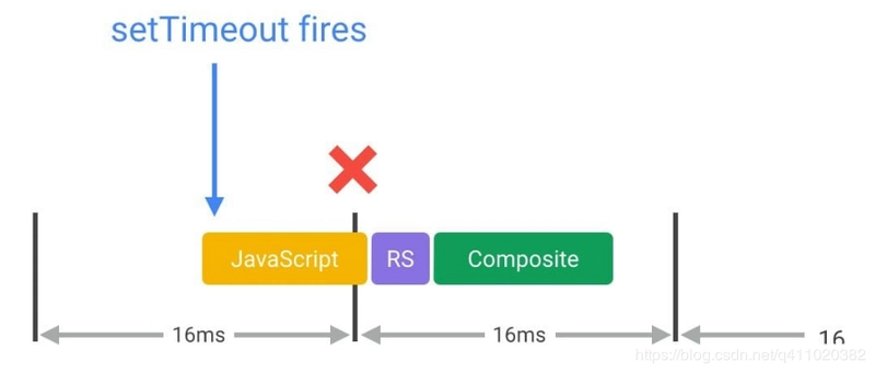
60fps and Device Refresh Rate
Currently, most devices have a screen refresh rate of 60 times/second. Therefore, if there's an animation or gradient effect on the page, or if the user is scrolling the page, the browser needs to render animations or pages at a rate that matches the device's screen refresh rate.
The budget time for each frame is just over 16 milliseconds (1 second / 60 = 16.66 milliseconds). But in reality, the browser has housekeeping work to do, so all your work needs to be completed within 10 milliseconds. If you can't meet this budget, the frame rate will drop, and content will jitter on the screen. This phenomenon is commonly known as stuttering and has a negative impact on user experience.
Quote source: Google Web Fundamentals - Rendering Performance

Suppose you use JavaScript to modify the DOM, trigger style changes, go through reflow and repaint, and finally paint to the screen. If any of these takes too long, it will cause the rendering time of this frame to be too long, and the average frame rate will drop. Suppose this frame took 50 ms, then the frame rate would be 1s / 50ms = 20fps, and the page would appear to stutter.
For some long-running JavaScript, we can use timers to split and delay execution.
for (let i = 0, len = arry.length; i < len; i++) {
    process(arry[i])
}
Suppose the loop structure above takes too long due to either the high complexity of process() or too many array elements, or both, you might want to try splitting.
const todo = arry.concat()
setTimeout(function() {
    process(todo.shift())
    if (todo.length) {
        setTimeout(arguments.callee, 25)
    } else {
        callback(arry)
    }
}, 25)
If you're interested in learning more, check out High Performance JavaScript Chapter 6 and Efficient Front-end: Web Efficient Programming and Optimization Practices Chapter 3.
Reference:
17. Use requestAnimationFrame to Implement Visual Changes
From point 16, we know that most devices have a screen refresh rate of 60 times/second, which means the average time per frame is 16.66 milliseconds. When using JavaScript to implement animation effects, the best case is that the code starts executing at the beginning of each frame. The only way to ensure JavaScript runs at the beginning of a frame is to use requestAnimationFrame.
/**
 * If run as a requestAnimationFrame callback, this
 * will be run at the start of the frame.
 */
function updateScreen(time) {
  // Make visual updates here.
}

requestAnimationFrame(updateScreen);
If you use setTimeout or setInterval to implement animations, the callback function will run at some point in the frame, possibly right at the end, which can often cause us to miss frames, leading to stuttering.
Reference:
18. Use Web Workers
Web Workers use other worker threads to operate independently of the main thread. They can perform tasks without interfering with the user interface. A worker can send messages to the JavaScript code that created it by sending messages to the event handler specified by that code (and vice versa).
Web Workers are suitable for processing pure data or long-running scripts unrelated to the browser UI.
Creating a new worker is simple, just specify a script URI to execute the worker thread (main.js):
var myWorker = new Worker('worker.js');
// You can send messages to the worker through the postMessage() method and onmessage event
first.onchange = function() {
  myWorker.postMessage([first.value, second.value]);
  console.log('Message posted to worker');
}

second.onchange = function() {
  myWorker.postMessage([first.value, second.value]);
  console.log('Message posted to worker');
}
In the worker, after receiving the message, we can write an event handler function code as a response (worker.js):
onmessage = function(e) {
  console.log('Message received from main script');
  var workerResult = 'Result: ' + (e.data[0] * e.data[1]);
  console.log('Posting message back to main script');
  postMessage(workerResult);
}
The onmessage handler function executes immediately after receiving the message, and the message itself is used as the data property of the event. Here we simply multiply the two numbers and use the postMessage() method again to send the result back to the main thread.
Back in the main thread, we use onmessage again to respond to the message sent back from the worker:
myWorker.onmessage = function(e) {
  result.textContent = e.data;
  console.log('Message received from worker');
}
Here we get the data from the message event and set it as the textContent of result, so the user can directly see the result of the calculation.
Note that inside the worker, you cannot directly manipulate DOM nodes, nor can you use the default methods and properties of the window object. However, you can use many things under the window object, including data storage mechanisms such as WebSockets, IndexedDB, and Firefox OS-specific Data Store API.
Reference:
19. Use Bitwise Operations
Numbers in JavaScript are stored in 64-bit format using the IEEE-754 standard. But in bitwise operations, numbers are converted to 32-bit signed format. Even with the conversion, bitwise operations are much faster than other mathematical and boolean operations.
Modulo
Since the lowest bit of even numbers is 0 and odd numbers is 1, modulo operations can be replaced with bitwise operations.
if (value % 2) {
    // Odd number
} else {
    // Even number
}
// Bitwise operation
if (value & 1) {
    // Odd number
} else {
    // Even number
}
How it works: The & (bitwise AND) operator compares each bit of the first operand to the corresponding bit of the second operand. If both bits are 1, the corresponding result bit is set to 1; otherwise, it's set to 0.
When we do value & 1, we're only checking the last bit of the number:
- For even numbers (e.g., 4 =
100in binary), the last bit is 0:100 & 001 = 000(0) - For odd numbers (e.g., 5 =
101in binary), the last bit is 1:101 & 001 = 001(1)
Floor
~~10.12 // 10
~~10 // 10
~~'1.5' // 1
~~undefined // 0
~~null // 0
How it works: The ~ (bitwise NOT) operator inverts all bits in the operand. For a number n, ~n equals -(n+1). When applied twice (~~n), it effectively truncates the decimal part of a number, similar to Math.floor() for positive numbers and Math.ceil() for negative numbers.
The process:
- First
~: Converts the number to a 32-bit integer and inverts all bits - Second
~: Inverts all bits again, resulting in the original number but with decimal part removed
For example:
~10.12 → ~10 → -(10+1) → -11
~(-11) → -(-11+1) → -(-10) → 10
Bitmask
const a = 1
const b = 2
const c = 4
const options = a | b | c
By defining these options, you can use the bitwise AND operation to determine if a/b/c is in the options.
// Is option b in the options?
if (b & options) {
    ...
}
How it works: In bitmasks, each bit represents a boolean flag. The values are typically powers of 2 so each has exactly one bit set.
-
a = 1: Binary001 -
b = 2: Binary010 -
c = 4: Binary100 -
options = a | b | c: The|(bitwise OR) combines them:001 | 010 | 100 = 111(binary) = 7 (decimal)
When checking if a flag is set with if (b & options):
-
b & options=010 & 111=010= 2 (decimal) - Since this is non-zero, the condition evaluates to true
This technique is extremely efficient for storing and checking multiple boolean values in a single number, and is commonly used in systems programming, graphics programming, and permission systems.
20. Don't Override Native Methods
No matter how optimized your JavaScript code is, it can't match native methods. This is because native methods are written in low-level languages (C/C++) and compiled into machine code, becoming part of the browser. When native methods are available, try to use them, especially for mathematical operations and DOM manipulations.
Example: String Replacement (Native vs. Custom)
A common pitfall is rewriting native string methods like replaceAll(). Below is an inefficient custom implementation versus the native method, with performance benchmarks:
// Inefficient custom global replacement (manual loop)
function customReplaceAll(str, oldSubstr, newSubstr) {
  let result = '';
  let index = 0;
  while (index < str.length) {
    if (str.slice(index, index + oldSubstr.length) === oldSubstr) {
      result += newSubstr;
      index += oldSubstr.length;
    } else {
      result += str[index];
      index++;
    }
  }
  return result;
}

// Efficient native method (browser-optimized)
function nativeReplaceAll(str, oldSubstr, newSubstr) {
  return str.replaceAll(oldSubstr, newSubstr);
}

// Test with a large string (100,000 repetitions of "abc ")
const largeString = 'abc '.repeat(100000);

// Benchmark: Custom implementation
console.time('customReplaceAll');
customReplaceAll(largeString, 'abc', 'xyz');
console.timeEnd('customReplaceAll'); // Output: ~5ms (varies by browser)

// Benchmark: Native method
console.time('nativeReplaceAll');
nativeReplaceAll(largeString, 'abc', 'xyz');
console.timeEnd('nativeReplaceAll'); // Output: ~2ms (typically 2-3x faster)
Key Takeaways
-
Performance: Native methods like
replaceAll()are optimized at the browser level, often outperforming handwritten code (as shown in the benchmark above). - Maintainability: Native methods are standardized, well-documented, and less error-prone than custom logic (e.g., handling edge cases like overlapping substrings).
- Ecosystem Compatibility: Using native methods ensures consistency with libraries and tools that rely on JavaScript’s built-in behavior.
When to Use Custom Code?
While native methods are usually superior, there are rare cases where you might need custom logic:
- When the native method doesn’t exist (e.g., polyfilling for older browsers).
- For highly specialized edge cases not covered by native APIs.
- When you need to avoid function call overhead in extremely performance-critical loops (e.g., tight numerical computations).
Remember: Browser vendors spend millions of hours optimizing native methods. By leveraging them, you gain free performance boosts and reduce the risk of reinventing flawed solutions.
21. Reduce the Complexity of CSS Selectors
(1). When browsers read selectors, they follow the principle of reading from right to left.
Let's look at an example
#block .text p {
    color: red;
}
- Find all P elements.
- Check if the elements found in result 1 have parent elements with class name "text"
- Check if the elements found in result 2 have parent elements with ID "block"
Why is this inefficient? This right-to-left evaluation process can be very expensive in complex documents. Take the selector #block .text p as an example:
- The browser first finds all
pelements in the document (potentially hundreds) - For each of those paragraph elements, it must check if any of their ancestors have the class
text - For those that pass step 2, it must check if any of their ancestors have the ID
block
This creates a significant performance bottleneck because:
- The initial selection (
p) is very broad - Each subsequent step requires checking multiple ancestors in the DOM tree
- This process repeats for every paragraph element
A more efficient alternative would be:
#block p.specific-text {
    color: red;
}
This is more efficient because:
- It directly targets only paragraphs with a specific class, avoiding checking all paragraphs
(2). CSS selector priority
Inline > ID selector > Class selector > Tag selector
Based on the above two pieces of information, we can draw conclusions.
- The shorter the selector, the better.
- Try to use high-priority selectors, such as ID and class selectors.
- Avoid using the universal selector *.
Practical advice for optimal CSS selectors:
/* ❌ Inefficient: Too deep, starts with a tag selector */
body div.container ul li a.link {
    color: blue;
}

/* ✅ Better: Shorter, starts with a class selector */
.container .link {
    color: blue;
}

/* ✅ Best: Direct, single class selector */
.nav-link {
    color: blue;
}
Finally, I should say that according to the materials I've found, there's no need to optimize CSS selectors because the performance difference between the slowest and fastest selectors is very small.
References:
22. Use Flexbox Instead of Earlier Layout Models
In early CSS layout methods, we could position elements absolutely, relatively, or using floats. Now, we have a new layout method flexbox, which has an advantage over earlier layout methods: better performance.
The screenshot below shows the layout cost of using floats on 1300 boxes:

Then we recreate this example using flexbox:
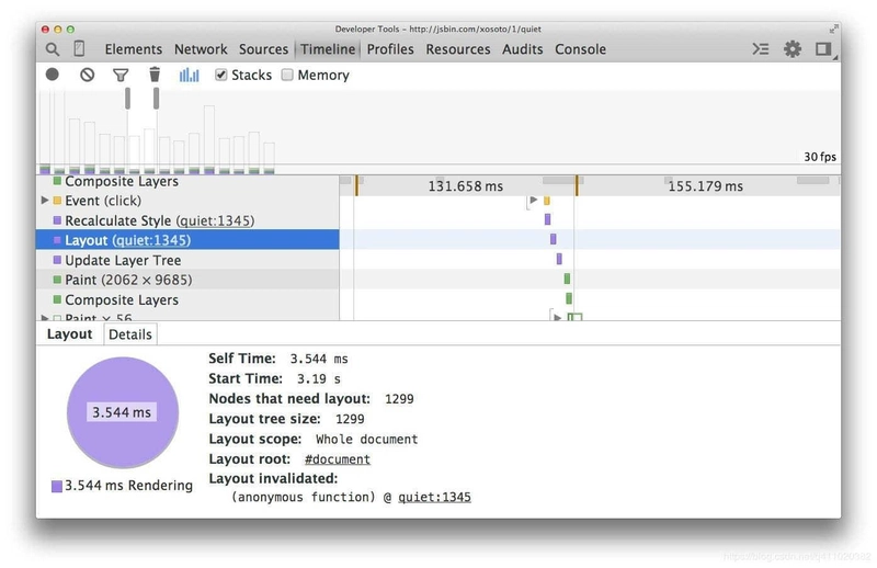
Now, for the same number of elements and the same visual appearance, the layout time is much less (3.5 milliseconds versus 14 milliseconds in this example).
However, flexbox compatibility is still an issue, not all browsers support it, so use it with caution.
Browser compatibility:
- Chrome 29+
- Firefox 28+
- Internet Explorer 11
- Opera 17+
- Safari 6.1+ (prefixed with -webkit-)
- Android 4.4+
- iOS 7.1+ (prefixed with -webkit-)
Reference:
23. Use Transform and Opacity Properties to Implement Animations
In CSS, transforms and opacity property changes don't trigger reflow and repaint, they are properties that can be processed by the compositor alone.

Example: Inefficient vs. Efficient Animation
❌ Inefficient animation using properties that trigger reflow and repaint:
/* CSS */
.box-inefficient {
  position: absolute;
  left: 0;
  top: 0;
  width: 100px;
  height: 100px;
  background-color: #3498db;
  animation: move-inefficient 2s infinite alternate;
}

@keyframes move-inefficient {
  to {
    left: 300px;
    top: 200px;
    width: 150px;
    height: 150px;
  }
}
This animation constantly triggers layout recalculations (reflow) because it animates position (left/top) and size (width/height) properties.
✅ Efficient animation using transform and opacity:
/* CSS */
.box-efficient {
  position: absolute;
  width: 100px;
  height: 100px;
  background-color: #3498db;
  animation: move-efficient 2s infinite alternate;
}

@keyframes move-efficient {
  to {
    transform: translate(300px, 200px) scale(1.5);
    opacity: 0.7;
  }
}
Why this is better:
-
transform: translate(300px, 200px)replacesleft: 300px; top: 200px -
transform: scale(1.5)replaceswidth: 150px; height: 150px - These transform operations and opacity changes can be handled directly by the GPU without triggering layout or paint operations
Performance comparison:
- The inefficient version may drop frames on lower-end devices because each frame requires:
- JavaScript → Style calculations → Layout → Paint → Composite
- The efficient version typically maintains 60fps because it only requires:
- JavaScript → Style calculations → Composite
HTML implementation:
<div class="box-inefficient">Inefficient</div>
<div class="box-efficient">Efficient</div>
For complex animations, you can use the Chrome DevTools Performance panel to visualize the difference. The inefficient animation will show many more layout and paint events compared to the efficient one.
Reference:
24. Use Rules Reasonably, Avoid Over-Optimization
Performance optimization is mainly divided into two categories:
- Load-time optimization
- Runtime optimization
Of the 23 suggestions above, the first 10 belong to load-time optimization, and the last 13 belong to runtime optimization. Usually, there's no need to apply all 23 performance optimization rules. It's best to make targeted adjustments based on the website's user group, saving effort and time.
Before solving a problem, you need to identify the problem first, otherwise you won't know where to start. So before doing performance optimization, it's best to investigate the website's loading and running performance.
Check Loading Performance
A website's loading performance mainly depends on white screen time and first screen time.
- White screen time: The time from entering the URL to when the page starts displaying content.
- First screen time: The time from entering the URL to when the page is completely rendered.
You can get the white screen time by placing the following script before </head>.
<script>
  new Date() - performance.timing.navigationStart
  // You can also use domLoading and navigationStart
  performance.timing.domLoading - performance.timing.navigationStart
</script>
You can get the first screen time by executing new Date() - performance.timing.navigationStart in the window.onload event.
Check Runtime Performance
With Chrome's developer tools, we can check the website's performance during runtime.
Open the website, press F12 and select performance, click the gray dot in the upper left corner, it turns red to indicate it has started recording. At this point, you can simulate users using the website, and after you're done, click stop, then you'll see the website's performance report during the runtime. If there are red blocks, it means there are frame drops; if it's green, it means the FPS is good. For detailed usage of performance, please search using a search engine, as the scope is limited.
By checking the loading and runtime performance, I believe you already have a general understanding of the website's performance. So what you need to do now is to use the 23 suggestions above to optimize your website. Go for it!
References:
Other References
- Why Performance Matters
- High-Performance Website Construction Guide
- Web Performance Authority Guide
- High-Performance JavaScript
- Efficient Front-end: Web Efficient Programming and Optimization Practices
Conclusion
Performance optimization is a critical aspect of modern web development that directly impacts user experience, engagement, and ultimately, business outcomes. Throughout this article, we've explored 24 diverse techniques spanning various layers of web applications - from network optimization to rendering performance and JavaScript execution.
Key Takeaways
Start with measurement, not optimization. As discussed in point #24, always identify your specific performance bottlenecks before applying optimization techniques. Tools like Chrome DevTools Performance panel, Lighthouse, and WebPageTest can help pinpoint exactly where your application is struggling.
Focus on the critical rendering path. Many of our techniques (placing CSS in the head, JavaScript at the bottom, reducing HTTP requests, server-side rendering) are centered around speeding up the time to first meaningful paint - the moment when users see and can interact with your content.
Understand the browser rendering process. Knowledge of how browsers parse HTML, execute JavaScript, and render pixels to the screen is essential for making informed optimization decisions, especially when dealing with animations and dynamic content.
Balance implementation cost vs. performance gain. Not all optimization techniques are worth implementing for every project. For instance, server-side rendering adds complexity that might not be justified for simple applications, and bitwise operations provide performance gains only in specific heavy computation scenarios.
Consider the device and network conditions of your users. If you're building for users in regions with slower internet connections or less powerful devices, techniques like image optimization, code splitting, and reducing JavaScript payloads become even more important.
Practical Implementation Strategy
Instead of trying to implement all 24 techniques at once, consider taking a phased approach:
-
First pass: Implement the easy wins with high impact
- Proper image optimization
- HTTP/2
- Basic caching
- CSS/JS placement
-
Second pass: Address specific measured bottlenecks
- Use performance profiling to identify problem areas
- Apply targeted optimizations based on findings
-
Ongoing maintenance: Make performance part of your development workflow
- Set performance budgets
- Implement automated performance testing
- Review new feature additions for performance impact
By treating performance as an essential feature rather than an afterthought, you'll create web applications that not only look good and function well but also provide the speed and responsiveness that modern users expect.
Remember that web performance is a continuous journey, not a destination. Browsers evolve, best practices change, and user expectations increase. The techniques in this article provide a strong foundation, but staying current with web performance trends will ensure your applications remain fast and effective for years to come.


Top comments (9)
Nice! These tips are super practical to boost front-end performance. How do you balance optimization with the complexity it might add to the project?
Thank you. I often only use browser cache and Nginx, lazy loading, code splitting, and code compression. These performance - optimization methods yield the greatest performance gains while being incredibly easy to implement.
Really appreciated the clarity and structure of this article — especially the breakdowns around HTTP2 and SSR. It’s great to see these performance fundamentals laid out so methodically.
I actually wrote a deep-dive recently on UI performance from a frontend developer’s perspective (a bit more opinionated and toolbox-driven than protocol-level), and found myself nodding at a lot of the same pain points.
Thanks for sharing this — bookmarked!
Thank you for your like.
Definitely bookmarking this for future reference. I've forgotten half these things
Thank you for your like.
Thank you for the sharing. It is broadening my knowledge.
That's nice.
Thank you for this.
I've been reading about Building large web apps, and needed to dive more into performance optimization