
TL;DR: Struggling to make your .NET MAUI DataGrid match your app’s theme? This blog shows you how to easily customize rows, headers, and selection styles using Syncfusion’s built-in theme resource keys and styling options, so your UI looks clean, modern, and consistent in light and dark modes.
When it comes to building modern, polished apps, appearance matters. With Syncfusion’s powerful .NET MAUI DataGrid, you’re not stuck with a default look, you can elevate your UI with just a few simple tweaks. Whether you’re targeting light or dark themes, or looking to reflect your brand’s unique style, customizing the DataGrid is both easy and flexible.
In this blog post, we’ll walk you through quick and effective ways to style your DataGrid, from row colors and fonts to header highlights and selection feedback. Using theme resource keys and intuitive styling options, you can transform your grid into a seamless extension of your app’s design.
Ready to turn default into delightful? Let’s get styling!
We’ll cover how to customize:
- Data row
- Header row
- Stacked header row
- Selection row
Data row customization
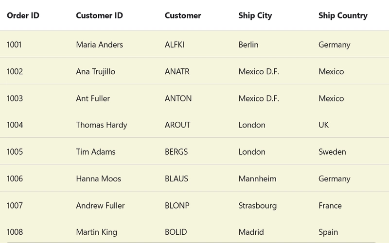
The appearance of Data row colors can be modified through the following approaches.
Method 1 : Effortless customization with default styles
Users can easily customize the appearance of rows in a ** SfDataGrid** by applying a default style. DataGridStyle is a Syncfusion-defined class that lets you customize the look and feel of the DataGrid. The RowBackground property specifically sets the background color of all data rows.
<syncfusion:SfDataGrid ItemsSource="{Binding OrderInfoCollection}">
    <syncfusion:SfDataGrid.DefaultStyle>
        <syncfusion:DataGridStyle RowBackground="Beige" />
    </syncfusion:SfDataGrid.DefaultStyle>
</syncfusion:SfDataGrid>
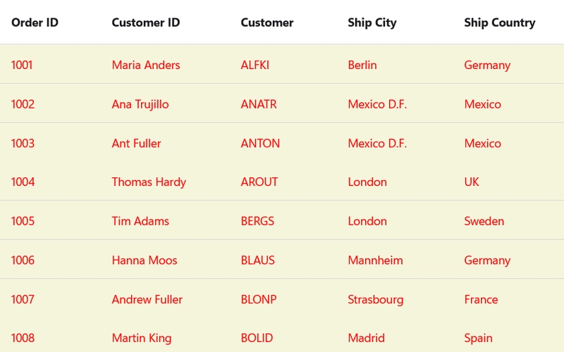
Method 2 : Create a consistent look with implicit styles
In SfDataGrid, users can easily apply styling to different parts of the grid using XAML. This style applies to all DataGridRow elements in the Syncfusion DataGrid, meaning it will automatically affect each row in the grid. When the style is applied, all rows in the DataGrid will have a beige background, making the data more visually appealing and easier to read. This approach is useful when you want a consistent look across the entire grid.
<Style TargetType="syncfusion:DataGridRow">
    <Setter Property="Background" Value="Beige" />
</Style>
Method 3 : Customize using DataGrid cells
In DataGrid component, this can be easily achieved by applying an implicit style to the DataGridCell. By defining an implicit style, developers can ensure consistent formatting throughout the entire DataGrid.
The user can customize the data row color by applying an implicit style to the DataGridCell. All DataGridCell in the Syncfusion DataGrid will have a beige background and red text color, giving a uniform appearance to all data rows.
<Style TargetType="syncfusion:DataGridCell">
    <Setter Property="Background" Value="Beige" />
    <Setter Property="TextColor" Value="Red" />
</Style>
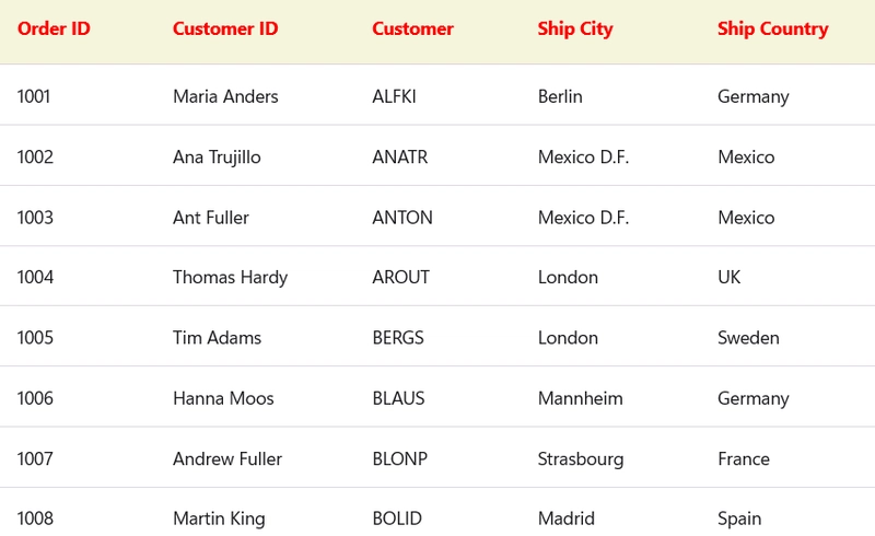
Header row customization
There are several approaches available to customize the color of the header row:
Method 1: Header row customization with default styles
Enhancing the visual appeal and readability of your ** SfDataGrid** can be achieved by customizing the header row’s appearance. The DefaultStyle property allows you to apply a uniform style to various parts of the grid, including the header row.
By setting the header row’s background color, you create a clear distinction between the headers and the data rows. Applying bold styling to the header text emphasizes the column titles, making them more prominent. Changing the font family adds a unique typographic touch; ensure this font is available and properly referenced in your project. Finally, coloring the header text provides a strong contrast against the background, making the headers stand out effectively.
<syncfusion:SfDataGrid ItemsSource="{Binding OrderInfoCollection}">
    <syncfusion:SfDataGrid.DefaultStyle>
        <syncfusion:DataGridStyle
            HeaderRowBackground="Beige"
            HeaderRowFontAttributes="Bold"
            HeaderRowFontFamily="Congenial Black"
            HeaderRowTextColor="Red" />
    </syncfusion:SfDataGrid.DefaultStyle>
</syncfusion:SfDataGrid>
Method 2: Header row customization with implicit styles
Users can modify the background color of the header row in a ** SfDataGrid*, users can define a style targeting the **DataGridHeaderRow* control. The Style element is set to apply to all DataGridHeaderRow elements within its scope by specifying syncfusion:DataGridHeaderRow as the TargetType. The Setter element assigns the color to the Background property of the header row, thereby altering its background color. This approach allows for a consistent and centralized way to style the header row’s background across your data grid.
<Style TargetType="syncfusion:DataGridHeaderRow">
    <Setter Property="Background" Value="Beige" />
</Style>
Method 3: Customize using DataGrid header cells
Customizing the appearance of the header cells in ** SfDataGrid** enhances the visual appeal and readability of your data grid. By defining a Style targeting the DataGridHeaderCell, you can uniformly apply specific styling attributes to all header cells. By applying this style, you achieve a customized header row that not only improves the aesthetics of your data grid but also contributes to a more intuitive and user-friendly interface.
Refer to the code example below,
<Style TargetType="syncfusion:DataGridHeaderCell">
    <Setter Property="FontAttributes" Value="Bold" />
    <Setter Property="Background" Value="Beige" />
    <Setter Property="FontFamily" Value="Congenial Black" />
    <Setter Property="TextColor" Value="Red" />
</Style>

Stacked header row customization
Method 1: Stacked header row customization with default styles
A stacked header enables grouping multiple columns under a single header label, enhancing both the structure and readability of your data grid. To further improve its visual appeal, you can customize the default style of the stacked header row.
- StackedHeaderRowBackground defines the background color of the stacked header row, adding a subtle and refined touch to the layout.
- StackedHeaderRowFontAttributes applies font styling, such as bold or italic, to make header text more prominent and easier to read.
- StackedHeaderRowFontFamily specifies the font used for header text, allowing you to create a more personalized and branded interface. (Ensure the chosen font is correctly added to your project resources.)
- StackedHeaderRowTextColor sets the text color of the stacked header row, helping to visually highlight header labels and improve contrast.
These properties together offer a simple yet effective way to align the grid’s appearance with your application’s design language.
Refer to the code example below,
<syncfusion:SfDataGrid.DefaultStyle>
    <syncfusion:DataGridStyle
        StackedHeaderRowBackground="Beige"
        StackedHeaderRowFontAttributes="Bold"
        StackedHeaderRowFontFamily="Congenial Black"
        StackedHeaderRowTextColor="Red" />
</syncfusion:SfDataGrid.DefaultStyle>
Method 2: Stacked header row customization with implicit styles
When using SfDataGrid in .NET MAUI, styling individual components enhances the overall appearance and improves user experience. One such component is the stacked header row, which allows grouping multiple columns under a single title.
Users can customize this row not just through the DefaultStyle property but also using XAML implicit styles. This defines a style that targets all instances of DataGridStackedHeaderRowView. This is the visual container for the stacked header row in SfDataGrid. Using this approach, you will apply styling globally to all stacked header rows within the scope (typically the page or application). Refer to the code example.
<Style TargetType="syncfusion:DataGridStackedHeaderRowView">
    <Setter Property="Background" Value="Beige" />
</Style>
Method 3: Customizing DataGrid stacked header cells
Users can customize the appearance of each stacked header cell —a UI element that appears when columns are grouped under a shared header. This specifies the control that the style will target: DataGridStackedHeaderCell. These are the individual cells within a stacked header row in SfDataGrid.
This makes it easy to apply a uniform appearance across all stacked header cells in your grid.
<Style TargetType="syncfusion:DataGridStackedHeaderCell">
    <Setter Property="FontAttributes" Value="Bold" />
    <Setter Property="Background" Value="Beige" />
    <Setter Property="FontFamily" Value="Congenial Black" />
    <Setter Property="TextColor" Value="Red" />
</Style>
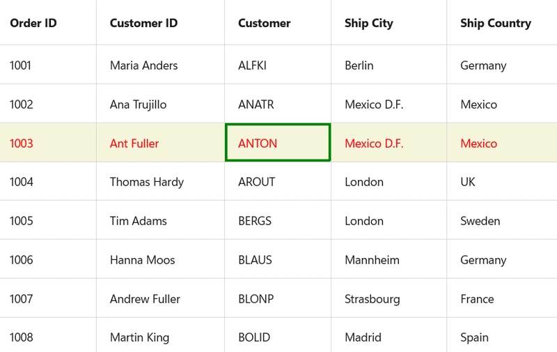
Selection row
The SfDataGrid from Syncfusion offers extensive styling capabilities that allow developers to create a more engaging and user-friendly interface. One important aspect of customization is how selected rows, and the active cell appear to users.
By using the DataGridStyle within SfDataGrid. DefaultStyle, users can significantly improve the visual feedback and user interaction experience of grid. These subtle changes can make a big difference in how users navigate and interact with your application’s data.
GitHub references
For more details, refer to the GitHub demo.
Conclusion
In this blog, we explored how to personalize the Syncfusion .NET MAUI DataGrid to create a visually cohesive and user-friendly interface. By leveraging built-in styling options and theme resource keys, developers can easily tailor every element of the DataGrid to match their app’s design. Feel free to try these customization techniques and let us know your thoughts in the comments below!
The latest version of Essential Studio® is available from the license and downloads page for our customers. If you’re not a Syncfusion® customer, try our 30-day free trial to evaluate our components.
If you have any questions or need assistance, you can reach us through our support forum, support portal, or feedback portal. We’re always here to help!
Related Blogs
- Essential® UI Kit for .NET MAUI 2.0.0: 8 Customizable Pages to Boost App Development
- Analyze and Track Investment Portfolios with .NET MAUI Toolkit Charts
- Build a To-Do List App with .NET MAUI – Step-by-Step Guide
- .NET MAUI in .NET 10 Preview: A Focus on Quality and the Developer Experience
This article was originally published at Syncfusion.com.


Top comments (0)