
Introduction
Visualizing data is crucial for understanding trends and distributions in web applications. Recharts, a popular React charting library, makes it easy to create interactive and responsive charts by combining the power of D3 with the flexibility of React components. It offers a sweet spot between customization and ease of use, whether you're building analytics dashboards or simple data displays while keeping bundle size in check.
In this article, we'll explore:
Building a Line Chart (for time-based trends)
Building a Pie Chart (for percentage distributions)
Handling Edge Cases in a Pie Chart (e.g when one category is 100%)
Dynamic Data Fetching & Optimization (using useMemo for performance)
Setting Up Recharts
First, install Recharts in your React project:
npm install recharts
Building a Line Chart (for time-based trends)
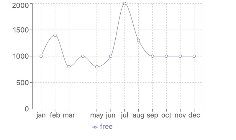
A line chart is ideal for showing trends over time (e.g., ticket sales by month).
Key Features:
Displays time-based data
Supports tooltips, legends, and custom styling
Responsive design
Implementation:
import "./styles.css";
import {
  LineChart,
  Line,
  XAxis,
  YAxis,
  CartesianGrid,
  Tooltip,
  Legend,
  ResponsiveContainer,
} from "recharts";

const data = [
  {
    name: "jan",
    free: 1000,


  },
  {
    name: "feb",
    free: 1400,


  },
  {
    name: "mar",
    free: 800,


  },
  {
    name: "apr",
    free: 1000,


  },
  {
    name: "may",
    free: 800,


  },
  {
    name: "jun",
    free: 1000,


  },
  {
    name: "jul",
    free: 2000,


  },
  {
    name: "aug",
    free: 1300,


  },
  {
    name: "sep",
    free: 1000,


  },
  {
    name: "oct",
    free: 1000,


  },
  {
    name: "nov",
    free: 1000,


  },
  {
    name: "dec",
    free: 1000,


  }

];

export default function App() {
  return (
    <LineChart
      width={500}
      height={300}
      data={data} // Data array (each object represents a point on the chart)
      margin={{
        top: 5,
        right: 30,
        left: 20,
        bottom: 5,
      }}
    >
      <CartesianGrid strokeDasharray="3 3" /> // Grid lines (dashed style)
        <XAxis
    dataKey="name"
    padding={{ left: 20, right: 20 }}
  />
      <YAxis />
      <Tooltip />

      <Line
        type="monotone"
        dataKey="free"
        stroke="#8884d8"
        activeDot={{ r: 8 }}
      />

    </LineChart>
  );
}
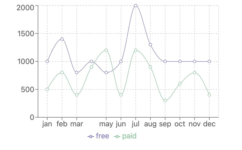
Comparing multiple datasets in a Line chart
import { LineChart, Line, XAxis, YAxis, CartesianGrid, Tooltip, Legend, ResponsiveContainer } from 'recharts';

const data = [
  {
    name: "jan",
    free: 1000,
    paid: 500,
  },
  {
    name: "feb",
    free: 1400,
    paid: 800,
  },
  {
    name: "mar",
    free: 800,
    paid: 400,
  },
  {
    name: "apr",
    free: 1000,
    paid: 900,
  },
  {
    name: "may",
    free: 800,
    paid: 1200,
  },
  {
    name: "jun",
    free: 1000,
    paid: 400,
  },
  {
    name: "jul",
    free: 2000,
    paid: 1200,
  },
  {
    name: "aug",
    free: 1300,
    paid: 900,
  },
  {
    name: "sep",
    free: 1000,
    paid: 300,
  },
  {
    name: "oct",
    free: 1000,
    paid: 600,
  },
  {
    name: "nov",
    free: 1000,
    paid: 800,
  },
  {
    name: "dec",
    free: 1000,
    paid: 400,
  },
];

export default function App() {
  return (
    <LineChart
      width={500}
      height={300}
      data={data}
      margin={{
        top: 5,
        right: 30,
        left: 20,
        bottom: 5,
      }}
    >
      <CartesianGrid strokeDasharray="3 3" />
      <XAxis dataKey="name" padding={{ left: 20, right: 20 }} />
      <YAxis />
      <Tooltip />
      <Legend />
      <Line
        type="monotone"
        dataKey="free"
        stroke="#8884d8"
        activeDot={{ r: 8 }}
      />
      <Line type="monotone" dataKey="paid" stroke="#82ca9d" />
    </LineChart>
  );
}
Building a Pie Chart
We'll look at both the basic implementation and the improved version with edge case handling.
Basic Implementation
import { PieChart, Pie, Cell } from "recharts";

const data = [
  { name: "Free", value: 400 },
  { name: "Paid", value: 300 },
];

const COLORS = ["#0088FE", "#00C49F"];

const RADIAN = Math.PI / 180;
const renderCustomizedLabel = ({
  cx,
  cy,
  midAngle,
  innerRadius,
  outerRadius,
  percent,
  index,
}) => {
  const radius = innerRadius + (outerRadius - innerRadius) * 0.5;
  const x = cx + radius * Math.cos(-midAngle * RADIAN);
  const y = cy + radius * Math.sin(-midAngle * RADIAN);

  return (
    <text
      x={x}
      y={y}
      fill="white"
      textAnchor={x > cx ? "start" : "end"}
      dominantBaseline="central"
    >
      {`${(percent * 100).toFixed(0)}%`}
    </text>
  );
};
export default function App() {
  return (
    <PieChart width={400} height={400}>
      <Pie
        data={data}
        cx={200}
        cy={200}
        labelLine={false}
        label={renderCustomizedLabel}
        outerRadius={80}
        fill="#8884d8"
        dataKey="value"
      >
        {data.map((entry, index) => (
          <Cell key={`cell-${index}`} fill={COLORS[index % COLORS.length]} />
        ))}
      </Pie>
    </PieChart>
  );
}
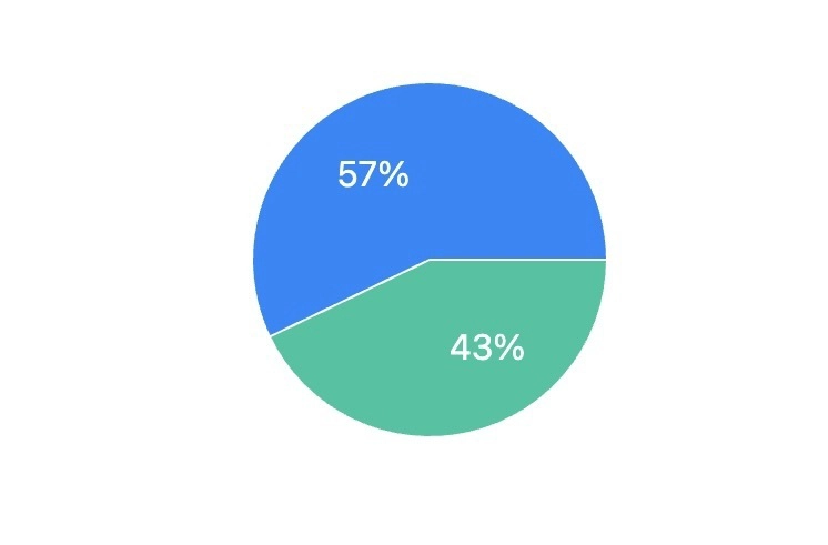
Limitations of this approach:
When one value is 100% and the other is 0%, the chart shows a tiny white line
The labels can become cramped or overlap in edge cases
There's no special handling for 100% dominance cases
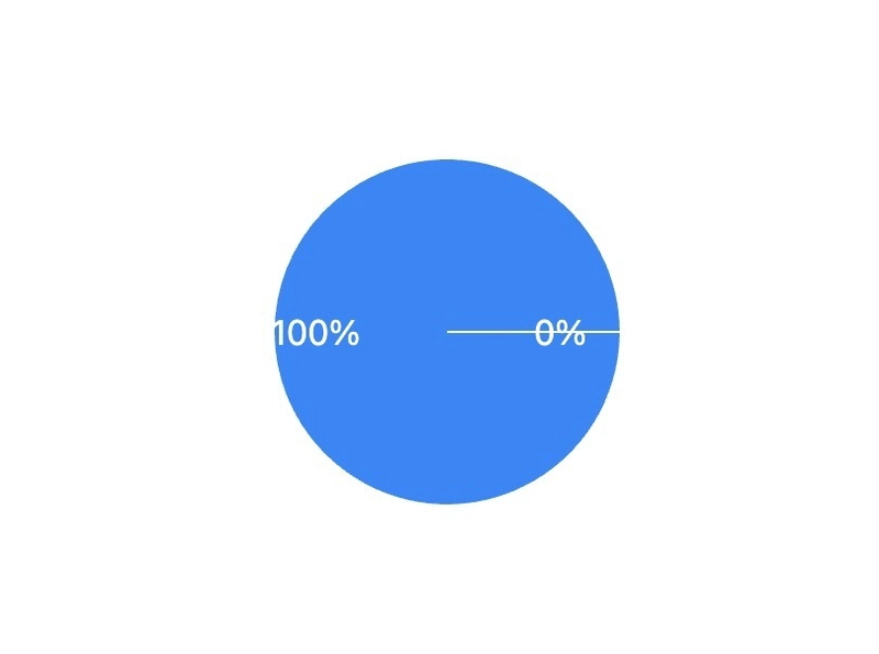
Here's the improved version that properly handles all cases:
import { PieChart, Pie, Cell, ResponsiveContainer } from "recharts";

const data = [
  { name: "Free", value: 100 },
  { name: "Paid", value: 0 },
];

const COLORS = ["#0088FE", "#00C49F"];

const RADIAN = Math.PI / 180;

const renderCustomizedLabel = ({
  cx,
  cy,
  midAngle,
  innerRadius,
  outerRadius,
  percent,
  index,
}) => {
  const has100Percent = data.some((item) => item.value === 100);

  if (has100Percent) {
    const dominantItem = data.find((item) => item.value === 100);
    return (
      <text
        x={cx}
        y={cy}
        fill="white"
        textAnchor="middle"
        dominantBaseline="central"
        style={{ fontSize: "16px", fontWeight: "bold" }}
      >
        {`${dominantItem.name}: 100%`}
      </text>
    );
  }

  return null;
};

const PieChartComponent = () => {
  // Filter out 0% values
  const filteredData = data.filter((item) => item.value > 0);

  return (
    <ResponsiveContainer width="100%" height={400}>
      <PieChart>
        <Pie
          data={filteredData} // Use filtered data here
          cx="50%"
          cy="50%"
          labelLine={false}
          label={renderCustomizedLabel}
          outerRadius={80}
          fill="#8884d8"
          dataKey="value"
          stroke="none"
        >
          {filteredData.map((entry, index) => (
            <Cell key={`cell-${index}`} fill={COLORS[index % COLORS.length]} />
          ))}
        </Pie>
      </PieChart>
    </ResponsiveContainer>
  );
};

export default PieChartComponent;

Finally we'll explore how to fetch and display dynamic data in your charts, focusing on performance optimization with useMemo
Why Use useMemo for Dynamic Charts?
When working with dynamic data in React charts, useMemo provides two key benefits:
Performance Optimization: It prevents unnecessary recalculations of your chart data on every render
Stable References: It ensures your chart components don't re-render unless the actual data changes
Dynamic Line Chart Implementation
Here's how to implement a dynamic line chart that works with fetched data
import { useState, useEffect, useMemo } from 'react';
import { LineChart, Line, XAxis, YAxis, CartesianGrid, Tooltip, Legend, ResponsiveContainer } from 'recharts';
import { useSalesData } from "lib/hooks";


const DynamicLineChart = ({ eventId }) => {

//assuming useSalesData is the hook i am fetching my sales data from
  const { data: salesData, loading } = useSalesData(eventId);

  // Transform data for the chart
  const chartData = useMemo(() => {
    if (!salesData?.monthlySales) return [];

    return salesData.monthlySales.map(month => ({
      name: month.month,
      free: month.free,
      paid: month.paid
    }));
  }, [salesData]);

  if (loading) return <div>Loading chart data...</div>;

  return (
    <ResponsiveContainer width="100%" height={300}>
      <LineChart
        data={chartData}
        margin={{ top: 5, right: 30, left: 20, bottom: 5 }}
      >
        <CartesianGrid strokeDasharray="3 3" />
        <XAxis dataKey="name" />
        <YAxis />
        <Tooltip />
        <Legend />
        <Line
          type="monotone"
          dataKey="free"
          stroke="#8884d8"
          activeDot={{ r: 8 }}
        />
        <Line
          type="monotone"
          dataKey="paid"
          stroke="#82ca9d"
        />
      </LineChart>
    </ResponsiveContainer>
  );
};

export default DynamicLineChart;
Dynamic Pie Chart Implementation
Here's how to implement a dynamic pie chart that works with fetched data
import { useState, useEffect, useMemo } from 'react';
import { PieChart, Pie, Cell, ResponsiveContainer } from 'recharts';
import { useTicketTypeData } from "lib/hooks";


const COLORS = ['#0088FE', '#00C49F'];

const DynamicPieChart = ({ eventId }) => {
//assuming useTicketTypeData is the hook i am fetching my ticket type data from
  const { data: ticketData, loading } = useTicketTypeData(eventId);

  // Transform data for the pie chart
  const pieData = useMemo(() => {
    if (!ticketData?.ticketTypes) return [];

    const total = ticketData.ticketTypes.free + ticketData.ticketTypes.paid;
    return [
      {
        name: 'Free',
        value: total > 0 ? (ticketData.ticketTypes.free / total) * 100 : 0
      },
      {
        name: 'Paid',
        value: total > 0 ? (ticketData.ticketTypes.paid / total) * 100 : 0
      }
    ];
  }, [ticketData]);

  if (loading) return <div>Loading pie chart data...</div>;

  return (
    <ResponsiveContainer width="100%" height={300}>
      <PieChart>
        <Pie
          data={pieData}
          cx="50%"
          cy="50%"
          labelLine={false}
          label={({ name, percent }) => `${name}: ${(percent * 100).toFixed(0)}%`}
          outerRadius={80}
          fill="#8884d8"
          dataKey="value"
        >
          {pieData.map((entry, index) => (
            <Cell key={`cell-${index}`} fill={COLORS[index % COLORS.length]} />
          ))}
        </Pie>
      </PieChart>
    </ResponsiveContainer>
  );
};

export default DynamicPieChart;
Conclusion
Recharts provides a powerful yet simple way to create dynamic, interactive data visualizations in React. By combining efficient data fetching with smart memoization techniques, you can build performant dashboards that gracefully handle real-world data scenarios. Remember to:
Always memoize data transformations with useMemo
Handle loading and error states
Consider edge cases like 100% values in pie charts
Leverage Recharts' responsive containers for mobile-friendly displays
With these patterns, you're well-equipped to create production-ready visualizations that bring your data to life.
References & Further Reading


Top comments (0)