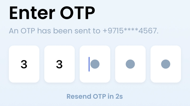
One-Time Passwords (OTPs) have become a standard in two-factor authentication. Here's a ready-to-use, customizable OTP input component for your React Native application that includes validation, animations, and a resend timer.
Features
- Customizable length (default: 5 digits)
- Auto-focus to next input on entry
- Focus previous input on backspace
- Animation feedback on input focus
- Built-in countdown timer for OTP resend
- Fully typed with TypeScript
- Works with React Native Unistyles
Component Code
Note: You can use react native StyleSheet also instead of react-native-unistyles.
import React, { useEffect, useRef, useState } from 'react';
import { View, TextInput, Animated, TouchableOpacity } from 'react-native';
import { createStyleSheet, useStyles } from 'react-native-unistyles';
import { boxShadow, hpx, wpx } from '@utils/Scaling';
import CustomText from './CustomText';
import { FONTS } from '@constants/Fonts';

interface OTPInputProps {
    value: string[];
    onChange: (value: string[]) => void;
    length?: number;
    disabled?: boolean;
    onResendOTP?: () => void;
}

export const OTPInput: React.FC<OTPInputProps> = ({
    value,
    onChange,
    length = 5,
    disabled = false,
    onResendOTP,
}) => {
    const { styles, theme } = useStyles(stylesheet);
    const inputRefs = useRef<TextInput[]>([]);
    const animatedValues = useRef<Animated.Value[]>([]);
    const [countdown, setCountdown] = useState(60);
    const [isResendActive, setIsResendActive] = useState(false);

    // Initialize animation values
    useEffect(() => {
        animatedValues.current = Array(length).fill(0).map(() => new Animated.Value(0));
    }, [length]);

    // Countdown timer
    useEffect(() => {
        let timer: NodeJS.Timeout;
        if (countdown > 0 && !isResendActive) {
            timer = setInterval(() => {
                setCountdown((prev) => prev - 1);
            }, 1000);
        } else if (countdown === 0) {
            setIsResendActive(true);
        }
        return () => {
            if (timer) clearInterval(timer);
        };
    }, [countdown, isResendActive]);

    const handleResendOTP = () => {
        if (isResendActive && onResendOTP) {
            onResendOTP();
            setCountdown(60);
            setIsResendActive(false);
            // Focus on first input after a small delay to ensure state is updated
            setTimeout(() => {
                focusInput(0);
            }, 50);
        }
    };

    const focusInput = (index: number) => {
        if (inputRefs.current[index]) {
            inputRefs.current[index].focus();

            // Trigger animation
            Animated.sequence([
                Animated.timing(animatedValues.current[index], {
                    toValue: 1,
                    duration: 100,
                    useNativeDriver: true,
                }),
                Animated.timing(animatedValues.current[index], {
                    toValue: 0,
                    duration: 100,
                    useNativeDriver: true,
                }),
            ]).start();
        }
    };

    const handleChange = (text: string, index: number) => {
        const newValue = [...value];
        newValue[index] = text;
        onChange(newValue);

        if (text && index < length - 1) {
            focusInput(index + 1);
        }
    };

    const handleKeyPress = (event: any, index: number) => {
        if (event.nativeEvent.key === 'Backspace' && !value[index] && index > 0) {
            focusInput(index - 1);
        }
    };

    return (
        <View style={styles.mainContainer}>
            <View style={styles.container}>
                {Array(length)
                    .fill(0)
                    .map((_, index) => {
                        const animatedStyle = {
                            transform: [
                                {
                                    scale: animatedValues.current[index]?.interpolate({
                                        inputRange: [0, 0.5, 1],
                                        outputRange: [1, 1.1, 1],
                                    }) || 1,
                                },
                            ],
                        };

                        return (
                            <Animated.View key={index} style={[styles.inputContainer, animatedStyle]}>
                                <TextInput
                                    ref={(ref) => {
                                        if (ref) inputRefs.current[index] = ref;
                                    }}
                                    style={[
                                        styles.input,
                                        value[index] ? styles.filledInput : {},
                                    ]}
                                    maxLength={1}
                                    keyboardType="number-pad"
                                    onChangeText={(text) => handleChange(text, index)}
                                    onKeyPress={(event) => handleKeyPress(event, index)}
                                    value={value[index]}
                                    editable={!disabled}
                                    selectTextOnFocus
                                    placeholder="●"
                                    placeholderTextColor={theme.colors.secondaryText}
                                />
                            </Animated.View>
                        );
                    })}
            </View>
            <TouchableOpacity
                onPress={handleResendOTP}
                disabled={!isResendActive}
                style={styles.resendContainer}
            >
                <CustomText
                    variant="sm"
                    style={{
                        color: theme.colors.navyBlueLine,
                        fontFamily: FONTS.SemiBold,
                        opacity: isResendActive ? 1 : 0.5
                    }}
                >
                    {isResendActive ? 'Resend OTP' : `Resend OTP in ${countdown}s`}
                </CustomText>
            </TouchableOpacity>
        </View>
    );
};

const stylesheet = createStyleSheet(({ colors }) => ({
    mainContainer: {
        width: '100%',
    },
    container: {
        flexDirection: 'row',
        justifyContent: 'space-between',
        alignItems: 'center',
        width: '100%',
        marginVertical: hpx(20),
    },
    inputContainer: {
        width: wpx(66),
        height: hpx(80),
        ...boxShadow.light,
    },
    input: {
        width: '100%',
        height: '100%',
        borderRadius: 10,
        backgroundColor: colors.white,
        textAlign: 'center',
        fontSize: 24,
        fontWeight: '600',
        color: colors.typography,
    },
    filledInput: {
        backgroundColor: colors.white,
        borderColor: colors.primary,
    },
    resendContainer: {
        alignItems: 'center',
    },
}));
Usage Example
Here's how to implement the OTP component in your screen:
import React, { useState } from 'react';
import { View } from 'react-native';
import { OTPInput } from './components/OTPInput';
import CustomText from './components/CustomText';

const OTPScreen = ({ navigation }) => {
    const [otpValues, setOtpValues] = useState(["", "", "", "", ""]);
    const [otpError, setOtpError] = useState(null);

    const handleOTPChange = (newValues) => {
        setOtpValues(newValues);
        setOtpError(null);
    };

    const handleResendOTP = () => {
        // Reset OTP values
        setOtpValues(["", "", "", "", ""]);
        setOtpError(null);
        // TODO: Add your API call to resend OTP here
    };

    const handleConfirm = () => {
        const otp = otpValues.join('');
        if (otp.length !== 5) {
            setOtpError('Please enter a complete OTP');
            return;
        }
        // Handle OTP verification here
        navigation.navigate('Home'); // Replace with your navigation logic
    };

    return (
        <View style={styles.container}>
            <View style={styles.formContainer}>
                <OTPInput
                    value={otpValues}
                    onChange={handleOTPChange}
                    length={5}
                    onResendOTP={handleResendOTP}
                />
                {otpError && (
                    <CustomText style={styles.errorText} variant="sm">{otpError}</CustomText>
                )}
            </View>

            {/* Add your button to submit OTP */}
            <Button title="Confirm" onPress={handleConfirm} />
        </View>
    );
};

const styles = StyleSheet.create({
    container: {
        flex: 1,
        padding: 20,
    },
    formContainer: {
        marginBottom: 20,
    },
    errorText: {
        color: 'red',
        textAlign: 'center',
        marginTop: 10,
    },
});

export default OTPScreen;
Customization
You can customize:
- Number of OTP fields by changing the
lengthprop - Countdown duration (default: 60s) by modifying the initial state
- Styling through the stylesheet
- Disable the component with the
disabledprop
Dependencies
- React Native
- React Native Unistyles
- You'll need to create/modify:
-
CustomTextcomponent -
boxShadow,hpx, andwpxutility functions -
FONTSconstant
-
Conclusion
This component provides a complete solution for OTP input in React Native applications with proper focus management, animations, and a resend timer. It's designed to be easily integrated into your authentication flow with minimal setup.
Happy coding!

Top comments (1)
Awesome work, You did excellently!